Tools

Slugline. Simple, elegant screenwriting.

Red Giant Color Suite, with Magic Bullet Looks 2.5 and Colorista II

Needables
  • Sony Alpha a7S Compact Interchangeable Lens Digital Camera
    Sony Alpha a7S Compact Interchangeable Lens Digital Camera
    Sony
  • Panasonic LUMIX DMC-GH4KBODY 16.05MP Digital Single Lens Mirrorless Camera with 4K Cinematic Video (Body Only)
    Panasonic LUMIX DMC-GH4KBODY 16.05MP Digital Single Lens Mirrorless Camera with 4K Cinematic Video (Body Only)
    Panasonic
  • TASCAM DR-100mkII 2-Channel Portable Digital Recorder
    TASCAM DR-100mkII 2-Channel Portable Digital Recorder
    TASCAM
  • The DV Rebel's Guide: An All-Digital Approach to Making Killer Action Movies on the Cheap (Peachpit)
    The DV Rebel's Guide: An All-Digital Approach to Making Killer Action Movies on the Cheap (Peachpit)
    by Stu Maschwitz

Entries in iPad (20)

Monday
Apr072014

Lightroom Mobile

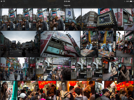
Adobe has released Lightroom mobile, an iPad companion app for Lightroom that syncs with your desktop catalog via Creative Cloud.

Is it the mobile companion app to Lightroom I asked for two years ago? Not exactly. It’s both much more, and a little less.

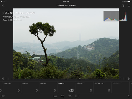
Lightroom mobile is based on the rather remarkable achievement of running the entire Adobe Camera Raw engine on your mobile device. This, combined with the recent addition of lightly-compressed proxies to the DNG format, means that Lightroom mobile can accurately edit the full range of values in your raw originals, and then sync those adjustments back to your main catalog.

If the editing features are miraculous, the sorting and metadata features are, let’s say, streamlined. The only thing you can sync are Collections. I don’t use Collections as a part of my organization, which means I have to create them just for the purpose of syncing. You choose which Collections sync, up to 60,000 photos.

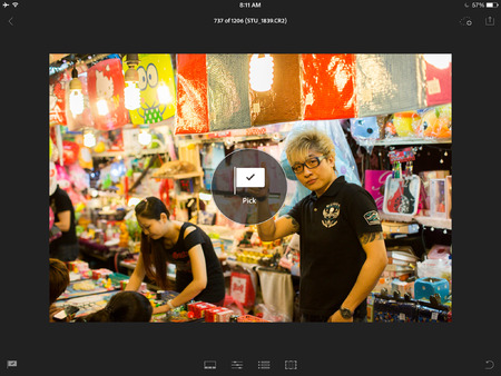
You can flag and reject shots. That’s it. No star ratings, color labels, no keyword tags. You can move/copy shots from one synced catalog to another though.

I’d suggested syncing the catalog, not the photos. I wanted organizing, not editing. Turns out, I love having the editing control. But it does come at the expense of speed and storage requirements. You can rapidly flip through shots and flag or reject them with a swipe. But as you do, Lightroom will be loading that whole DNG proxy.

Lightroom mobile lets you sit back on your couch and rapidly triage a shoot, flagging and rejecting shots easily. There’s more than enough editing control to make an informed decision of whether a shot is a keeper or not.

If you collaborate, it’s pretty cool to hand off your iPad to a colleague (or spouse) and ask them to pick their favorites. Keep the desktop version up as they do, with a filter for Flagged, and watch your screen fill up with their selects.

I wanted a mobile companion app to help me keep up with the endless task of sorting and organizing my main catalog. We didn’t quite get that. Instead, we got some organization and metadata tools, and impressive, if not as obviously utilitarian, editing capabilities.
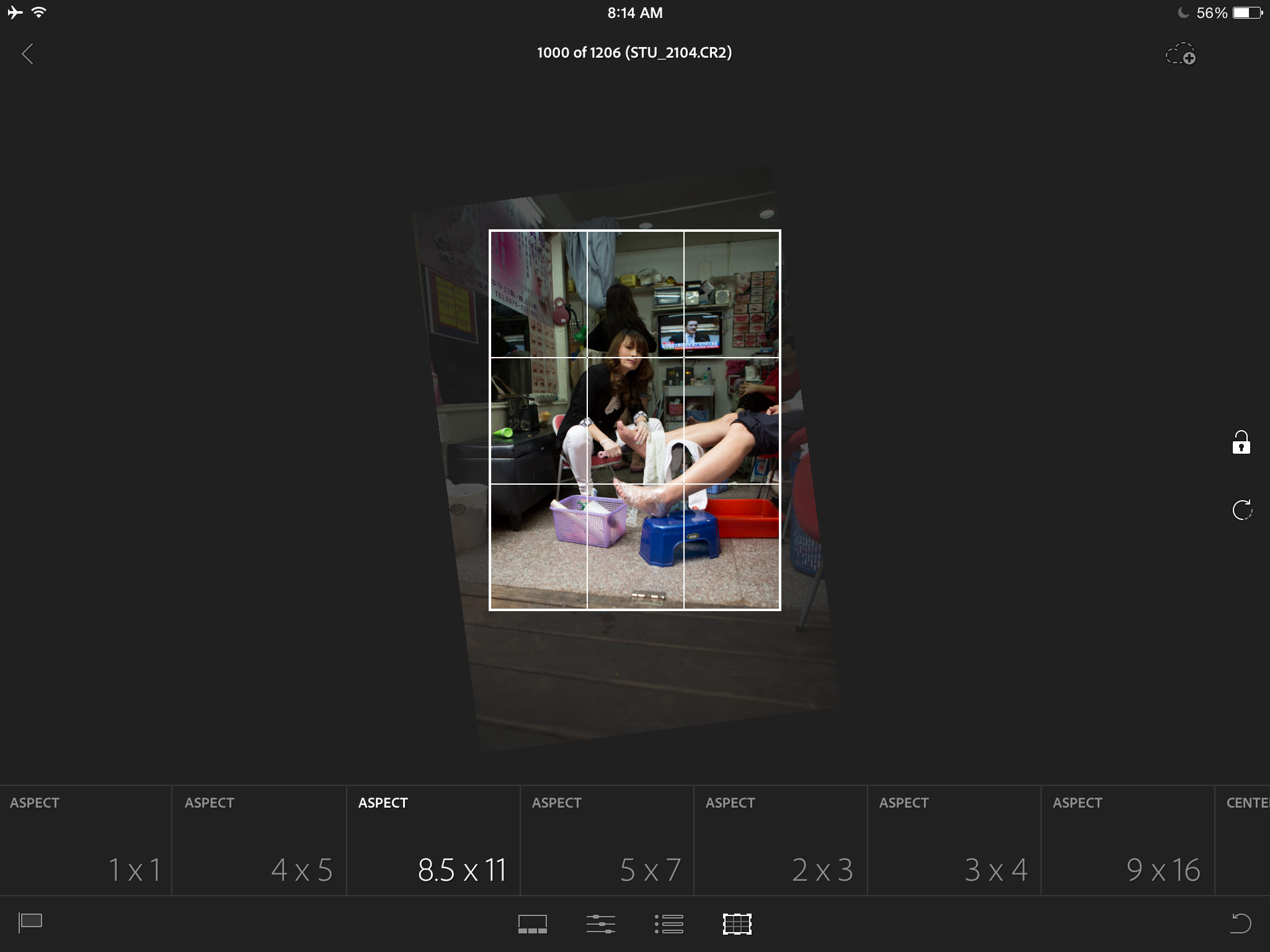
I like Lightroom Mobile enough that I bought a new iPad with LTE so I could use it to its fullest. It’s super useful, even if it’s not exactly what I wanted. Which is exactly what a 1.0 should be. With that in mind, here’s what I’d love to see in future updates:

  • Lightweight syncing of my entire catalog. I don’t need DNG Proxies for everything, but a thumbnail would be great.
  • Keyword tags, and the ability to search/sort by them.
  • Reverse geocoding. Show me my photos taken near where I’m standing, or let me tag a photo with my current location.
  • Presets. The ones in Lightroom mobile are Adobe-supplied. I’d like to be able to selectively sync presets from Lightroom Desktop.
  • Collaboration. I’d like to be able to share photos with a collaborator and let them set metadata separately from mine. Let me, the agency, and the client all make our selects, and then allow only me to see how they overlap.

Lightroom mobile is a free download on the App Store, and requires one of several several existing Creative Could plans, including the Photoshop Photography Program at USD $9.99/month. It requires Lightroom 5.4, also released today. An iPhone version is coming soon.

Monday
Sep022013

Prolost Boardo

Some people procrastinate writing by shopping for notebooks, or perfecting their Markdown preview CSS. Some procrastinate their work by cleaning their desk, and some procrastinate cleaning their desk by working.

I procrastinate storyboarding a new video I’m working on by creating iPad templates and After Effects presets designed to make storyboarding easier.

If you read my post on storyboarding on the iPad, you may remember that my app of choice was Penultimate. I lovingly created storyboard templates for it and defended its clean simplicity. Penultimate makes it easy to sketch out, edit, and rearrange a series of boards using a custom template, and export the results to a PDF.

There was one feature that I wished for however: the option to export to individual, numbered PNG files. If all you want to do with a storyboard is print or share it, a PDF is perfect. But if you want to take the frames and create something else with them, it’s much better to have them as individual files.

For example, you might want to bring them into Storyboard Composer HD, where, right on your iPad, you can sequence them into a timed-out animatic, or board-o-matic. complete with camera moves and sound.

Or you may want to edit this board-o-matic on your computer. Usually I use NLE software such as Adobe Premiere for this kind of thing, but the power this solution offers comes with a price: doing some things is less simple than in a dedicated app such as Storyboard Composer.

It occurred to me that I could use After Effects to automate some of the most common board-o-matic tasks. Although After Effects is not a great environment for creative editorial, it is an excellent platform for automating some kinds of motion and imaging tasks.

But first I needed to solve my problem of getting individual PNG files of my storyboards. I began investigating tools for ripping images out of PDFs, and simultaneously I continued my gentle harassment of Penultimate’s creator, Ben Zotto. The app allows a single page to be exported as a PNG, so, I reasoned, there’s a certain consistency in offering this option for multi-page exports.

You may recall that Ben and I blogged back and forth about how users should best make feature requests of developers. It was a bit of a love-fest, and I deeply admired Ben’s commitment to a simple, clean, user experience.

In May of 2012, Penultimate was acquired by Evernote, and is now free. It’s still great, but I’m no longer using Penultimate for storyboarding on the iPad.

A Little Less Less

Back when I first posted about storyboarding, many readers suggested alternatives to Penultimate. There is no shortage of busy, complex, feature-crowded notebook apps in the App Store. Most of the suggested apps made my head hurt with their cluttered UIs. But a few folks suggested that I look at Noteshelf ($5.99 on the App Store).

It’s hard to imagine that Noteshelf didn’t draw inspiration from Penultimate in its design and feature set. It’s a note-taking and drawing app that works on the model of multi-page notebooks that can be lined with various virtual “papers,” including ones you create yourself.

Most importantly for my storyboarding workflow: your drawings can be exported with, or—crucially, without, the paper template embedded, in various formats, to various destinations, including numbered PNG files to Dropbox.

But Noteshelf is not just a me-too app. It’s sturdy, attractive, well thought-out, and not without restraint. And there are a few things about it that I like better than Penultimate. Its “ink” overlaps more realistically. It features highlighter “markers” that are great for shading storyboards. And it works much better in landscape orientation.

Templates

Like Penultimate, Noteshelf allows you to create custom paper templates. But instead of helpfully packaging them up in a unique file type that can be one-tap installed like Penultimate, Noteshelf simply offers the option to import any image from your iPad’s Photo Library.

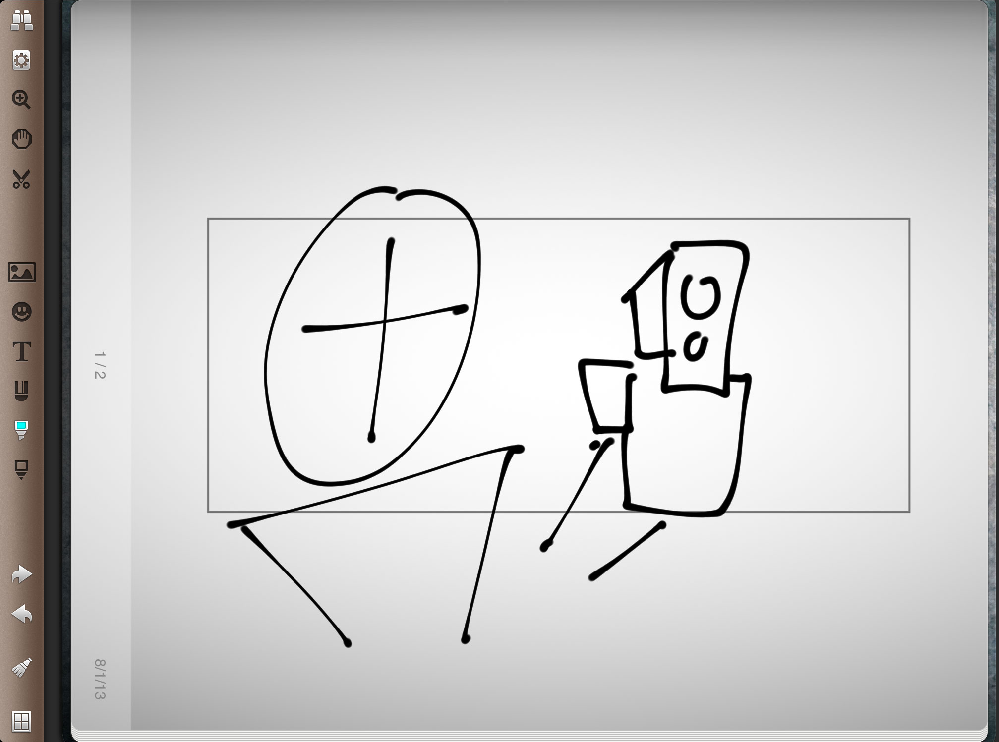
Quirks aside, Noteshelf offers almost everything I want from an iPad storyboarding sketchbook, and few things I don’t. I can quickly bang out a bunch of questionably-legible cinematic chicken-scratches and export them to my laptop. So what do I do with them then?

Prolost Boardo for After Effects

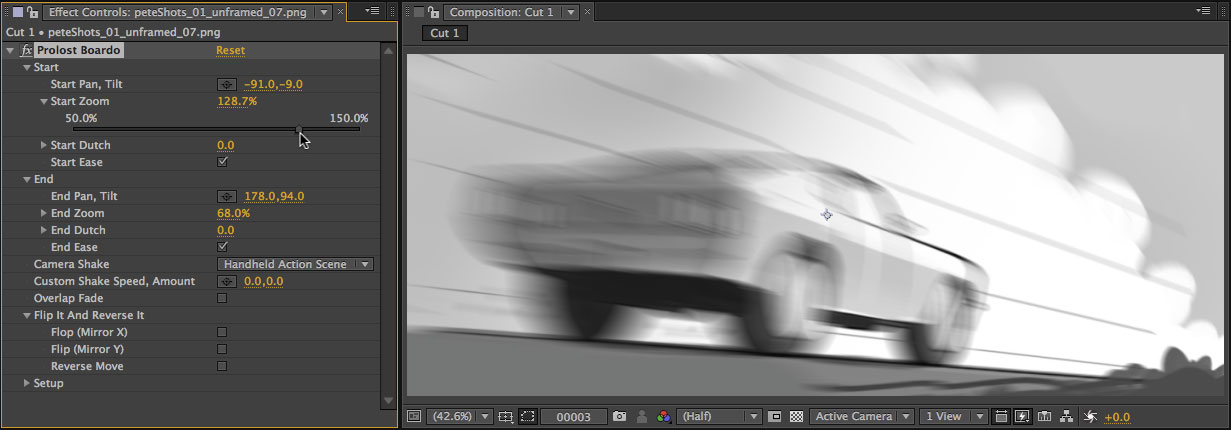
Prolost Boardo is a set of three Animation Presets for Adobe After Effects that automate the process of creating an animated storyboard, or board-o-matic.

Easily create animated camera moves, including cross-dissolves, camera shake, and cycling animations, all without using any keyframes.

The video shows you how it works, but it’s deceptively simple. There’s some complex math going on under the hood to make these virtual camera moves smooth, realistic, and predictable. Anyone who’s ever tried to animate 2D artwork in an NLE can tell you how frustrating it can be.

Boardo, on the other hand, makes it so easy that you might use it just for fun.

Boardo works with any kind of storyboards, wherever you create them (and includes instructions on customizing the settings for whatever format you like), but it defaults to work with frames drawn in Noteshelf using one of two templates. You can download them here.

This is is the most powerful and complex tool I’ve created for the Prolost Store, and I really think you’re going to like it. Prolost Boardo is available now for $24.99.

Thursday
May022013

Adobe Shows Off That Lightroom Thing I Described

Lightroom product manager Tom Hogarty appeared on Scott Kelby’s show The Grid and showed a “technology preview” of Creative Cloud-synced raw photo editing on an iPad.

Sounds familiar!

And although Tom mostly showed visual editing, necessary for a sexy demo, he spent a good deal of time talking about the value of organizational tools such as sorting and reading, which is where I think the real value lies, as I wrote last year:

What I want from a mobile Lightroom companion is a way to utilize whatever idle time I might have here and there for productive work on my main Lightroom Catalog. I don’t want to send new photos to it. I don’t want to adjust exposure and color temperature. I just want to do what I never seem to have enough time to do at home: housekeeping.

Half the reason I use Lightroom over the other DAM/raw processing tools out there is that I like it better. The other half is that I love the way Adobe engages with the community. You can have a relationship with Adobe, and software is a relationship.

So thanks for the tease Tom! Looks great. Just please dodn’t get so wrapped up in the sexiness of mobile editing that you forget about the incredible value of sorting and tagging on the go.

Tuesday
Nov272012

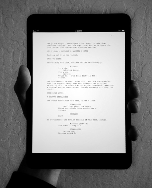
Reading Screenplays on the iPad mini

John August responds to the question of whether the iPad mini is good for reading screenplays:

It is. It’s really good.

I agree completely. Even without a retina display, the mini is a thoroughly pleasant device for reading. And dictating script notes via Siri feels enough like living in the future that I barely miss my flying car.

John’s feelings about the inexpensive but unpretty GoodReader app match mine, and my recommendation hasn’t changed since I wrote about reading screenplays on the iPad Maxi: Spend a few extra bucks and get PDF Expert. It syncs with Dropbox, exports annotations as text files, and won’t hurt your eyes. My only complaint is an old one: with no ability to offset page numbering (to account for page 1 of the PDF corresponding to the unnumbered title page of a screenplay), your exported annotations will be off by one page.

Small price to pay for a hundred screenplays in your pocket.