The easiest way to support Prolost is to begin your Amazon, iTunes, Mac App Store, Zacuto or B&H shopping here. You can drag those links to your bookmarks bar so you never forget. It costs you nothing and it really helps. Thanks!
After my Fetishists post, I was invited by Mike Seymour to join he and Jason on Red Centre to discuss in greater detail the points I raised. It was a welcome opportunity both to drill down on each of the specific issues, and to clarify a few things that some of the many comments seemed to miss—namely, that I chose my “fetishists” out of respect (so please, those of you with the pitchforks, put ‘em away), and that as crowd-pleasing as a “shut up and shoot” post can be, this actually wan’t meant to be one. The truth is, all your favorite filmmakers are fetishists, and you should be one too if you want your films to be their best.
Technology and gear are not the first things I think about when I think about filmmaking, but they do tend to be the first things I blog about. If “none of the tech matters, just make a movie” was the end of the conversation then that would be the end of ProLost. Talking tech is great, and nobody does it better than Red Centre, so please subscribe if you haven’t already, and give a listen to episode 66.
If you’d like to play the home game while listening, here are full-size stills of the image of Mike from the post, before and after color correction. These stills are pulled from 5D Mark II footage I shot of Mike in the Tsukiji Fish Market in Tokyo, and you can decide for yourself if it’s compression, 8-bit-ness, or an insidious combination of the two that makes it tough to brighten Mike’s face.
Click for full-res camera original imageClick for full-res, graded image
Click for full-res, graded image with some preprocessing
On the show Mike also mentioned that he’s embarking on a new fxphd DSLR Video course as a follow-up to the popular-but-aging session that he and I shot in Japan. This time, Mike has nabbed someone who actually knows what he’s talking about, none other than Tyler Ginter of the 55th Combat Camera Company. I look at a helicopter and think, “how can I put this in my movie?” Tyler looks at one and says “I think I’ll jump out of that with 90 pounds of gear strapped to me (including a 5D Mark II). Check out Tyler’s videos on Vimeo and stay tuned to fxphd for more updates.
In my last post I made a barbed remark about the Sony NEX-VG10, based on early reports that it only shot 60i (NTSC) and 50i (PAL). Turns out it may actually have a progressive mode, which would make the PAL version an option for filmmakers in PAL countries, or those in the U.S. willing to jump through the 25/24 speed-change hoops like we old fogies once did with the first DV cameras. Personally, I’ll wait for real 24p, the importance of which Sony, unlike Canon, cannot pretend to be unaware. Now that so many camera manufacturers are fighting to give us DV Rebels exactly what we want, I won’t be expending any energy on cameras that don’t.
And last but not least, if you’re not on Twitter, this might be a good week to start.
Yesterday Red Giant Software announced the release of Magic Bullet PhotoLooks. It’s the same Magic Bullet Looks you know and love, re-engineered for use on high resolution stills in Adobe Photoshop.
In case you don’t know, Looks, and now PhotoLooks, is a creative toolset for giving your images an overall cinematic look. It’s based on the model of an actual camera, with filters, lens characteristics, and film processing tricks. By accurately simulating the physics of light, glass, and celluloid, it creates a fun, creative environment for experimenting with your shots. Start with one of 100 presets, see how they’re put together, then modify them to taste—or design your own and share them with friends.
Longtime Magic Bullet Looks users will recognize the interface, presets, and tools—so much so that they might even wonder what’s new about this new version. A lot has changed under the hood, but all in ways designed not to be noticed. Here are some examples:
That PhotoLooks is a native Photoshop plug-in means that not only can you use it directly from within Photoshop, but you can also use Photoshop’s Smart Layers to keep PhotoLooks as a non-destructive adjustment that you can tweak again and again, even after closing and re-opening the file. Aharon Rabinowitz shows you how to do this in the above tutorial.
PhotoLooks contains the beginnings of a Color Management solution, so that your color-managed Photoshop workflow will match what you see in the PhotoLooks UI. Future versions will refine and enhance this feature to work with any popular color space you might care to use for your photography workflow.
The last one is the biggest change and hopefully the most invisible: The Looks rendering engine has been re-written completely to work on high-resolution stills. While working on your look, you get the fluid, GPU-accelerated experience Looks has always provided, but when you press OK, your look is rendered by the new CPU render engine that can handle the gigantic image sizes common to current-generation cameras. If you’ve used the “secret” stills feature of Magic Bullet Looks, you may have run up against limitations in resolution. That won’t happen with PhotoLooks.
What’s fun for me, as the guy who designed it, is to see a whole new legion of creative professionals exposed to the power and creativity of Magic Bullet Looks. Here are some of their impressions:
I am not exaggerating when I say that Magic Bullet PhotoLooks will re-invent the way people think about filters in Photoshop—I have never seen anything like it.
-Deke McClelland, award-winning Photoshop author, and trainer
Another favorite feature of mine is the Look Theater. I get creatively stumped with my photography occasionally, and it is so cool to be able to just sit and watch my photographs take on a new persona without me having to lift a finger.
-Justin Seeley, Photoshop trainer and graphic designer
Magic Bullet PhotoLooks is a fantastic tool, with absolutely no adoption curve.
To make a perfect look for a photo [using Photoshop’s built-in tools] can be an arduous process of changing levels, curves, diffusion, glows, spot exposure, color correction, vignetting, edge softness, etc. However, the thumbnail for each of the 100+ presets in Magic Bullet PhotoLooks instantly updates to show its effect on your photo making it really easy to compare the effect of each one.
Magic Bullet Mojo has been out for a few months now, and you guys seem to be figuring it out fine on your own, but I thought I’d record this guided tour anyway, because when I put the headset mic on I feel just like Janet Jackson.
Magic Bullet Mojo is $99 on its own, or available as a part of the Magic Bullet Suite.
In many of my writings about color correction, both here on ProLost and in The Guide, I’ve talked about the balance between an aggressive “look” that helps tell your story through the use of a pervasive palette, tone, style, and feel; and the preservation of appealing skin tones. When grading a scene, you can push your look much further if you don’t lose track of appealing skin tones. Or, if you so desire, you can make a strong visual statement by choosing to allow your skin tones to get subsumed by your look.
The truth is, skin tones are just one of a small handful of what I call “memory colors.” Memory colors are colors that are, in the minds of your audience, inseparable from certain common objects or events. For example, the sky is so associated with blue that you might feel that you see those two words together as often as you see them individually. The same goes for green and grass.
The most basic idea of color correcting is that you are making colors correct, which is to say that you are making objects on the screen appear to be the colors that we know them to be.
The funny thing about this seemingly simple task is that it can be quite difficult. And it’s difficult for exactly the reason that it’s important.
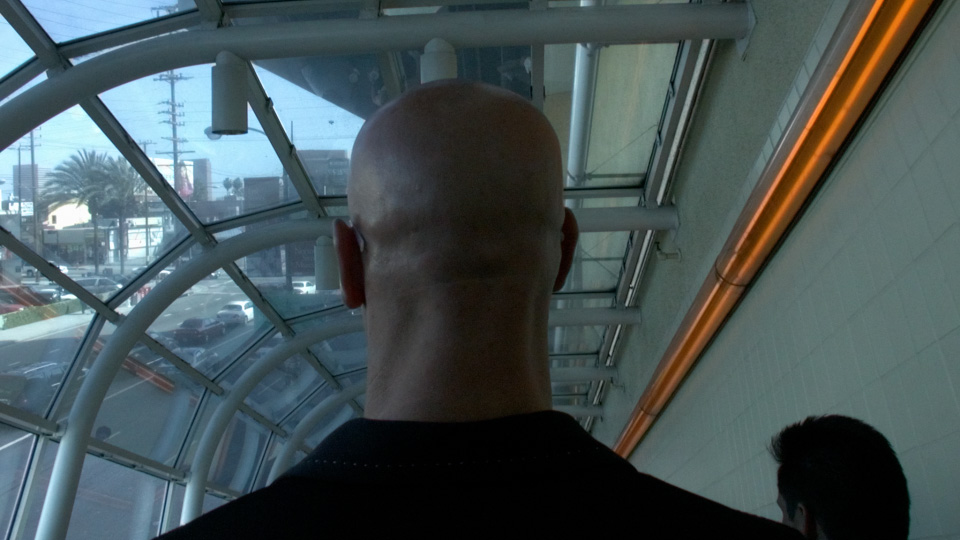
The human brain is so tied in to our eyesight that we internally auto-correct for certain colors. This is the very definition of a memory color. For example, if you grew up in the United States, you know that a stop sign is red—so you tend to see an image of one as being red even if the color is way out of whack. In the shot below, we recognize the bald head as that of a Caucasian male, even though the white balance is incorrect.
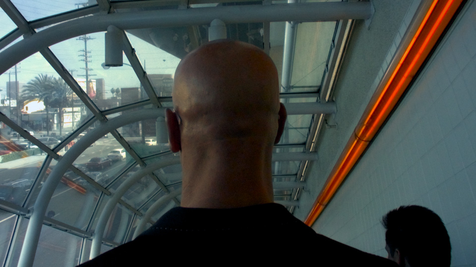
We see his head as skin-colored, even though empirically it is actually almost perfectly gray! You might not believe me, so here’s a crop of the back of his neck to prove it:
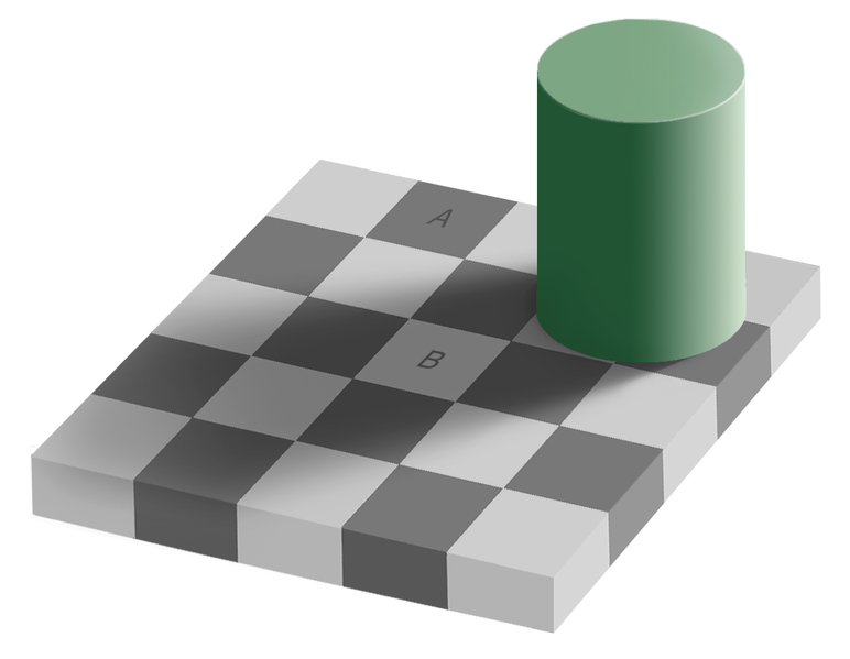
This a variation of a common optical illusion called the Same Color Illusion. We “know” that square A and B are different shades of gray “in real life,” and that knowledge prevents us from seeing that they are in fact the exact same shade in the image (click the image to see proof).
Back to the head. Even though they “know” what color it is, your audience will respond more favorably to a memory color object if their knowledge of it matches their experience, rather than fights it. And so it falls to the colorist to correct the color of the head, to make it head-colored rather than gray.
In 2008 I pointed out an example of this from the trailer for The Incredible Hulk (Steve Bowen, colorist). Edward Norton’s face appears the same color whether in a cool scene or a warm scene.
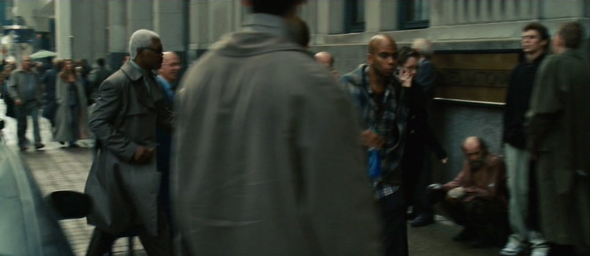
Preserving skin tones is important, but so is preserving other memory colors. Here’s a shot from Jumper (Steven J. Scott, colorist). Sam Jackson is about to walk through a crowd of people. His and their skin tones are accurate, even though their world is a faded, monochrome olive drab.
But back up a few seconds in the same shot and notice that in this faded world, brake lights are perfect, vivid red, and New York taxis read as the correct yellow-orange. This is an establishing shot, and if the grade abused the hue of the taxis too harshly, we might not read “New York” as readily.
Here’s a very short list of memory colors I try to keep in mind when coloring:
People are pink/orange (a color I like to call porange)
Grass and summer trees are green
Water and skies are blue
Fire engines, stop signs, and blood are red
You could also add just about any food to that list. Unless you’re deliberately trying to make something look unappetizing, it’s probably good to render food as accurately as possible—as I’ll show you in a moment.
I welcome your suggestions of other memory colors. And bear in mind that memory colors might vary from film to film and even scene to scene. In Stomp the Yard, there’s a scene at the beginning where almost nothing is red. Later, there’s a red jacket color so important to the story that it leaps out of every scene in which it appears.
So what’s the big deal? Objects have colors, and the colorist makes sure those things stay those colors. Easy, right?
Not necessarily. To achieve the look of that Jumper shot—where key colors pop but unimportant ones blend into a complimentary shade of blue-green—requires practice, skill, and taste. It’s hard enough under the best of circumstances, but lighting, atmosphere, bounce light, flare, camera settings, and a hundred other factors can conspire to force objects to render on-screen in colors quite unlike their real-world hues.
The good colorist first picks the memory colors important to the scene, and then ensures that they stay consistent, often combating these factors to do so.
Here’s a very simple example. I bought some espresso beans today from my favorite local roaster, Blue Bottle coffee. As I was transferring them to an air-tight container, my 7D was right there, so I popped off a quick 720p60 shot of the process—because who doesn’t like seeing coffee beans tumble in slow motion?
When looking at the footage on my computer, I noticed a funny thing. The beans, which in life have a vivid, sumptuous brown tone, appeared gray-black on my screen. I almost didn’t notice, because I know they are brown, but on close inspection it was clear that I had been fooled by my brain into seeing what I knew rather than what was actually there. The cool color temperature of the indirect sun lighting the shot was reflecting off the beans and cooling their color down to near neutral.
There’s nothing unnatural or wrong about this, except that the audience for my espresso epic doesn’t know about the cool light source outside of the frame. They don’t even necessarily know what the falling objects are. I have to communicate that visually, so I need to preserve—or, in this case, recreate—the memory color of perfectly roasted coffee beans.
Here’s the shot with a Colorista Power Mask for just the beans:
And here’s that same shot with an overall look applied after the bean color fix.
To really see the importance of the local correction, look at the shot with the look, but without the bean fix:
Not only do the beans look more appetizing with the fix, they also survive the subsequent look adjustment better. In fact, since the look cools down the shot a bit, the warm color of the beans stands out all the more. Without the bean fix, the look utterly clobbers the brown beans. As a bonus, in the corrected version, the metal canister and the corner of the grinder on the right take on a steely blue color, better matching the viewer’s idea of what color metal should be.
If you pick your memory colors for a scene, and preserve and enhance them through your look, you’ll wind up with shots that pop without looking clobbered by a heavy-handed “preset” look.
Update on Monday, February 22, 2010 at 3:43PM by
Stu
Folks following me on Twitter know that I’ve been posting the occasional color correction before/after example there. I’ve now collected them here, including a higher-res version of the coffee bean example.


;) Click for full-res camera original image
Click for full-res camera original image;) Click for full-res, graded image
Click for full-res, graded image;) Click for full-res, graded image with some preprocessing
Click for full-res, graded image with some preprocessing 13 Comments