


Memory Colors
In many of my writings about color correction, both here on ProLost and in The Guide, I’ve talked about the balance between an aggressive “look” that helps tell your story through the use of a pervasive palette, tone, style, and feel; and the preservation of appealing skin tones. When grading a scene, you can push your look much further if you don’t lose track of appealing skin tones. Or, if you so desire, you can make a strong visual statement by choosing to allow your skin tones to get subsumed by your look.
The truth is, skin tones are just one of a small handful of what I call “memory colors.” Memory colors are colors that are, in the minds of your audience, inseparable from certain common objects or events. For example, the sky is so associated with blue that you might feel that you see those two words together as often as you see them individually. The same goes for green and grass.
The most basic idea of color correcting is that you are making colors correct, which is to say that you are making objects on the screen appear to be the colors that we know them to be.
The funny thing about this seemingly simple task is that it can be quite difficult. And it’s difficult for exactly the reason that it’s important.
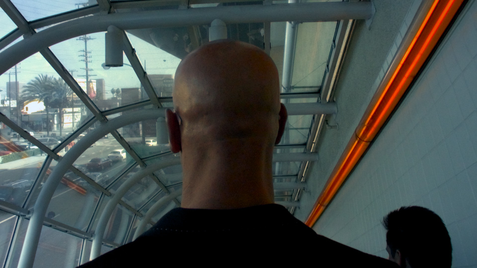
The human brain is so tied in to our eyesight that we internally auto-correct for certain colors. This is the very definition of a memory color. For example, if you grew up in the United States, you know that a stop sign is red—so you tend to see an image of one as being red even if the color is way out of whack. In the shot below, we recognize the bald head as that of a Caucasian male, even though the white balance is incorrect.
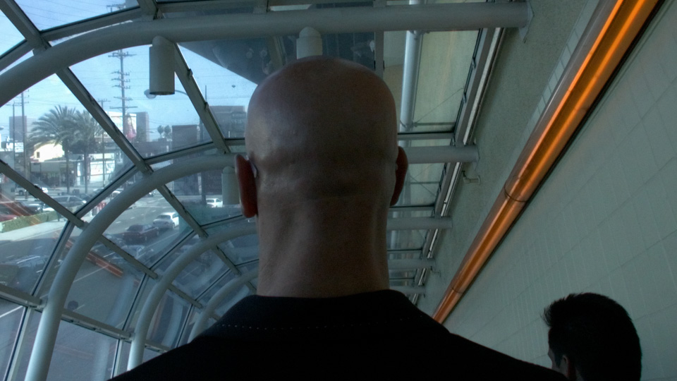
We see his head as skin-colored, even though empirically it is actually almost perfectly gray! You might not believe me, so here’s a crop of the back of his neck to prove it:

This a variation of a common optical illusion called the Same Color Illusion. We “know” that square A and B are different shades of gray “in real life,” and that knowledge prevents us from seeing that they are in fact the exact same shade in the image (click the image to see proof).
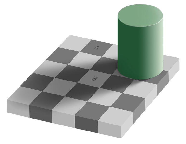
UPDATE: Aaron points out below that the Color Constancy Illusion may be a better model of the problem.
Back to the head. Even though they “know” what color it is, your audience will respond more favorably to a memory color object if their knowledge of it matches their experience, rather than fights it. And so it falls to the colorist to correct the color of the head, to make it head-colored rather than gray.
In 2008 I pointed out an example of this from the trailer for The Incredible Hulk (Steve Bowen, colorist). Edward Norton’s face appears the same color whether in a cool scene or a warm scene.

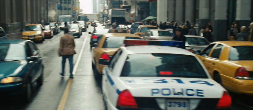
Preserving skin tones is important, but so is preserving other memory colors. Here’s a shot from Jumper (Steven J. Scott, colorist). Sam Jackson is about to walk through a crowd of people. His and their skin tones are accurate, even though their world is a faded, monochrome olive drab.
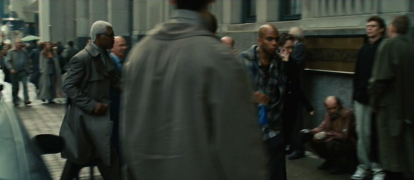
But back up a few seconds in the same shot and notice that in this faded world, brake lights are perfect, vivid red, and New York taxis read as the correct yellow-orange. This is an establishing shot, and if the grade abused the hue of the taxis too harshly, we might not read “New York” as readily.
Here’s a very short list of memory colors I try to keep in mind when coloring:
- People are pink/orange (a color I like to call porange)
- Grass and summer trees are green
- Water and skies are blue
- Fire engines, stop signs, and blood are red
You could also add just about any food to that list. Unless you’re deliberately trying to make something look unappetizing, it’s probably good to render food as accurately as possible—as I’ll show you in a moment.
I welcome your suggestions of other memory colors. And bear in mind that memory colors might vary from film to film and even scene to scene. In Stomp the Yard, there’s a scene at the beginning where almost nothing is red. Later, there’s a red jacket color so important to the story that it leaps out of every scene in which it appears.
So what’s the big deal? Objects have colors, and the colorist makes sure those things stay those colors. Easy, right?
Not necessarily. To achieve the look of that Jumper shot—where key colors pop but unimportant ones blend into a complimentary shade of blue-green—requires practice, skill, and taste. It’s hard enough under the best of circumstances, but lighting, atmosphere, bounce light, flare, camera settings, and a hundred other factors can conspire to force objects to render on-screen in colors quite unlike their real-world hues.
The good colorist first picks the memory colors important to the scene, and then ensures that they stay consistent, often combating these factors to do so.
Here’s a very simple example. I bought some espresso beans today from my favorite local roaster, Blue Bottle coffee. As I was transferring them to an air-tight container, my 7D was right there, so I popped off a quick 720p60 shot of the process—because who doesn’t like seeing coffee beans tumble in slow motion?

When looking at the footage on my computer, I noticed a funny thing. The beans, which in life have a vivid, sumptuous brown tone, appeared gray-black on my screen. I almost didn’t notice, because I know they are brown, but on close inspection it was clear that I had been fooled by my brain into seeing what I knew rather than what was actually there. The cool color temperature of the indirect sun lighting the shot was reflecting off the beans and cooling their color down to near neutral.
There’s nothing unnatural or wrong about this, except that the audience for my espresso epic doesn’t know about the cool light source outside of the frame. They don’t even necessarily know what the falling objects are. I have to communicate that visually, so I need to preserve—or, in this case, recreate—the memory color of perfectly roasted coffee beans.
Here’s the shot with a Colorista Power Mask for just the beans:

And here’s that same shot with an overall look applied after the bean color fix.

To really see the importance of the local correction, look at the shot with the look, but without the bean fix:

Not only do the beans look more appetizing with the fix, they also survive the subsequent look adjustment better. In fact, since the look cools down the shot a bit, the warm color of the beans stands out all the more. Without the bean fix, the look utterly clobbers the brown beans. As a bonus, in the corrected version, the metal canister and the corner of the grinder on the right take on a steely blue color, better matching the viewer’s idea of what color metal should be.
If you pick your memory colors for a scene, and preserve and enhance them through your look, you’ll wind up with shots that pop without looking clobbered by a heavy-handed “preset” look.
Want to learn more? Check out some great books on color correction at the ProLost Store, or find more ProLost posts tagged with Color.
 Stu
Stu
Reader Comments (51)
Great post, Stu. Color theory at its best. After reading this, I couldn't help but think how "memory colors" might apply to black and white footage. Does seeing a world rendered in BW activate our imagination more since we're unconsciously filling in all the color detail? Do we feel more engaged or more removed? Can a lack of color focus our attention elsewhere? Interesting stuff. Thanks for the thought-provoking post.
Stu -
Informative, and entertaining as always... Thanks so much for your insight!
As a 'Guide' owner, I was wondering when you're coming out with a book on color-correcting - it seems there's more than enough content for a book; and I for one, would be the first in line.
Regards,
Matt
I love it. I was thinking about color in movie for a while. I've read about it in "the guide", the book "The Art of Color", listened to psychology lectures about color, and did a hell lot of experiments in AE. Color's so important and so much fun to play with (assuming you have "digital negative" shots)
That's a great question Stephen. I totally agree that black and white photography involves the viewer more by showing them less. Color can be an enormous burden for the filmmaker. Like Stephen King says in his book On Writing, the filmmaker is often doomed to show too much. When you choose to add color to your storytelling, you either need to take control of it and show only the right colors, or risk drowning out your story in a sea of noise.
Hi Stu,
Very interesting post. Thanks for writing this! I just had one of those moments where you realize you've actually kind-of been doing this for a while without knowing it. It helps, though, once you realize why it's important.
I'm a photographer first and this can also be very useful in stills photography. I don't know many people who use film techniques in photography, but it helps me get the look I'm after. In my experience a lot of the knowlegde from both sides crosses over really well. I was wondering what you thoughts about that are?
Ronald
"memory colors" is really called Semiotics in visual culture.
Great clear informative information, as always. Thanks Stu!
What if the audience expects dark roast beans? I do, and my "fix" would be darker.
Grass and trees are NOT green. There is a significant amount of yellow in there. In fact there is often more yellow than green, but as you say; we want to think it's green.
There's also this whole thing with decades of watching nuanced green trees and other greens on NTSC, which, in its very nature, reproduced green in a somewhat crippled way. (Has something to do with how the color burst signal was engineered and blah blah blah). We get used to something that isn't 'right'. So there's a cultural overlay...we see and remember color the way we've been presented it/tem over and over. But now, on somewhat more glorious HD, we see a bunch of greens we've 'never seen before', and I've of course noticed vivid oranges too (like on the AT&T commercial tags) reproduce way differently than on NTSC. And so we'll get used to this, and then...?
Once again, Stu, your "food for thought" is a sumptuous feast, not a mere snack.
I'd also like to point out that humans are all largely the same hue (hue-mans?) while shifting mostly in value. Don't believe me? Take a properly lit and shot image of anyone, of any ancestry of your choice, and look at the trace on a vectorscope. We're lighter or darker, true, yet we all fall in the same few degrees on that utterly honest trace.
And to speak, however briefly, to Stephen Carr, there are tonalities in black and white work as well. I loved Agfa Portriga for people photography back in the old darkroom days - its warmth flattered skin tones like no other paper. Hit it with the right amount of selenium (highly unrecommended due to nasty health effects) and it took on an interesting "split-tone" which made parts warmer and other parts cooler, creating an illusion of depth.
I love black and white. In the same way as Stu's post on "using your film-making" it makes us use our photography. And I don't at all mind a black and white film. Even when there are tonalities represented within the frame...
Love the post Stu. I am curious about B&W too. I swear growing up with only a B&W TV I could tell which color was which (not green grass and sky blue--I'm talking red and blue cars, green jackets, etc...). Later on a color TV I would prove myself correct. Now that's some STRONG memory colors.
Harva, "semiotics" generally refers to signs and symbols. Using a color as a sign of something is cool, but that's not quite the same thing as memory colors, it's just another form of visual symbolism. See the use of red in Hitchcock's The Birds, or orange in The Exorcism of Emily Rose. There is a bit of a blurry line here, as colors can have associations with specific emotions and states of mind, but that's not what I'm talking about in this post. For a great read on that, I recommend If It's Purple, Someone's Gonna Die by Patti Bellantoni.
Rich, if you expect dark roast, then neither I nor Blue Bottle can help you. I like to taste the bean, not the burn!
Sjur, good point. In fact grass and trees can look pretty weird if you make them too perfectly green. But often they come in from the camera almost pure yellow, and adding a bit of green can help the image feel more like our memories of foliage.
Alan, I wrote about the homogenous hue of humanity (and used a different terrible pun) back in 2007: Hue Are You?
Doug, I also grew up with a B&W TV, and never had an problems with it. When we got our first color TV, one of my biggest surprises was that the Hulk (in the 1978 Bill Bixby TV series) was green!
Great read Stu, as always. But did you mean to say that the bald head is Caucasian? He looks African-American to me.
He does, more so in the corrected version, which means I didn't do a very good job grading the shot. I was trying to change as little as possible about the "look," so I didn't correct for the underexposure of his head.
"And for those of you watching in Black & White, the blue ball is to the right of the pink"
Interesting read. Introduces an aspect that I have never really thought about before.
I mostly grade by instinct on what I like after much experimentation, but keeping in mind the aspect of masking and preserving colors other than skin tone and exposures will stay with me for a while now.
In some cases though like with many fantasy type films I think that it could be a good idea to ignore everything, if you are trying to create a look that purposefully strays away from reality to confuse people as part of the plot and how you want them to feel while watching your story.
Do you think this may be simply a matter of "color constancy" rather than "same color illusion?" It seems more likely to me given the examples.
Aaron, I think you make a good point. Here's a link to a good example of the Color Constancy illusion:
http://www.squarefree.com/2004/03/05/color-constancy-illusion/
I've included the link in the body of the article as well. Thanks for the help!
Great post Stu, I love reading these posts about color grading beacuse there's a lot about the technical side out there, but not so much on the theory. And the possibilites on a color grading program are so huge that a beginner has to ask himself what should he really do. These kind of articles really help us guide our way around, with a clarity and understanding that many of my university teachers haven't even dreamt of achieving.
Thanks.
"I haz seen colurz in my cheezburger"...
Another incredible illusion that beautifully illustrates the same principle:
http://land.t-a-y-l-o-r.com/
DP
- you talked about it, but how to actually ACHIEVE it? i mean, how to color grade a shot without interfere on color skin and without adding masks?
- what are the tools and the steps to take on a color grade software and HDSLR's high compressed footage to achieve it?
- can you talk more about the new hollywood trends on color grading, such as the orange skin and the gray buildings turning emerald blue and how to achieve it?
Thanks Stu! This was really helpful as it's something I really need to get a handle on. I made sure to write this down in my checklist. So far, this has been the most succinct and easy to understand explanation I've read yet!
Thanks.
Gustavo, did you not see this post?
http://prolost.com/blog/2009/6/23/got-me-a-side-job.html
One of the best posts I have read on this here site! Fantastic one, Fantastic examples and great explanation. I really appreciate the time put into this all together. Thanks for continuing to provide terrific content.
Long time listener, first time caller: Fantastic post! Thank you thank you thank you
Stu,
Interesting as always. I used to do a lot of B&W still photography and have done sound post for years. The thing that jumped out at me was that it took YERS for sound to become an artistic partner in film. And I think in someways color had the same kind of constraining impact on films. Now with digital color correction color can be a part of the partnership in ways that were not really possible before. Also like sound things are often NOT what we think they are. Frying chicken and rain are almost indistinguishable with out context. So we (sound folks) are often looking for what it "should" sound like to serve the story rather than what it actually sounds like. As a rule recording the "real thing" is not going to get you what you need. I'm getting excited about that the new age of color correction might bring back some of the highly stylized looks that were much more common in B&W.
I'm also in SF and roast my own coffee and am not into the over roasted style. You might enjoy the info at Sweet Maria's. They are across the bay. I'll have to try Blue Bottle.
Cheers
SK
A very informative post, thank you.
This is the first time I've come across your blog, will endeavour to keep checking back in the future for more tips.
~ Mike
snow. white or blueish. if it's yellow, don't eat it.
Great article! I just found out about your site and I love it!
I have a question regarding color correction for tv vs computer.
Do you have to grade a video diferently for tv and for computer monitors?
I wish I have everyday a post like this. Thanks for extend my horizons, Stu.
Great post, Stu...another in a long line of well presented articles.
Stu, love this approach of “memory colors.”...are colors that are, in the minds of your audience. Such a better starting point... thanks for this.
A pro colorist said to me 4:4:4 color sampling make all the difference in the world. It's the only way to achieve good color. What are your thoughts on this idea?
Rob, I agree with the first part and disagree with the second. 4:4:4 does make all the difference in the world, but you can certainly make beautiful pictures without it. If you're stuck with low-color-sampling footage, such as from most prosumer camcorders and all HDSLRs, I recommend using the Deartifactor plug-in that comes with Magic Bullet Frames to upsample the chroma.
http://www.redgiantsoftware.com/products/all/magic-bullet-frames/
That plus a 16-bit project in After Effects and you'll be shocked how good subsampled chroma video can look.
I love your color correction posts. They are a fantastic resource and I'd love to see more. Thank you.
Hi Stu!
Love your blog. I just have an HDV project going on were I all did the denoising with the denoise plugin of Magic Bullet Steady. Whats the difference to the Deartifactor of MBFrames? Would you suggest to redo it with the Deartifactor?
Thanks a lot for your advice...
Max
Stu,
Speaking of color correction. Will there be an update to Colorista soon? It would be great if it had numeric settings. Unfortunately when I upgraded to Snow Leopard it wouldn't work with CS3 anymore.
Its my first time reading your article, and what a fanstasticly simple and easy to understand idea you have put forward. You said it in one article than a whole chapter in a textbook !
Funny, all these while my objectives were to 'bring out', 'neutralize', or 'make it look pretty' in coloring. Now, at least there is a simpler much more distinct thing to look for.
Thanks Stu!
I know this is a bit off the topic but hopefully someone will be able to answer this question for me. Is there a "standard" or "ideal" setting to a monitor? The reason I ask is because when I view this page on my mac the colors are clear and crisp. When I view it from an older Dell monitor the colors look different. I've heard over an over about calibrating a monitor, but I'm not really sure what that means or better yet what I should be calibrating it to look like. I think the concept of coloring is wonderful but if all monitors are set up differently what is the real point of coloring at all?
Hi Brother Darrell (or are you the other brother Darrell?),
In the world of video, there is one display calibration standard that everyone uses (or one for each video standard anyway). In the computer display world, there is not. However, Macs ship with color management turned on, and with a display profile appropriate for the display you're using. The display profile is a description of how that monitor renders color, and it can be used by color managed applications to ensure that the colors you see are the colors intended by the person who created them.
Safari on the Mac is a color managed browser, so if you're looking at ProLost on a Mac using Safari, chances are you're seeing the images correctly.
You can enable color management on Firefox on both Mac and Windows:
http://blog.patyuen.com/2009/07/04/firefox-35-and-color-management/
I recommend setting 1, full color management.
Why so blue Stu? I do like the cool steel look but note you use it almost exclusively in your before after shots and here with the beans ... wonder do you have any special reason for that look or is it just a personal preference?
Thanks for the insight.
Hi Andy,
Did you see this color correction tutorial I did on matching the looks of big Hollywood movies?
http://prolost.com/blockbuster
The one thing they have in common is that cool tint to the shadows. And for good reason—it makes skin tones stand out and lends a more balanced feel.
If you were to look at the before/after images on a vectorscope, you'd see that the befores are actually biased heavily to the warm quadrant, whereas the afters are more evenly distributed across warm/cool. More examples of that here:
http://prolost.com/saveourskins
Does that mean cool is the only way to go? Of course not. But as you watch movies, you'll probably start to notice that a "neutral" scene tends to contain a balance of warm and cool. For my examples, I just happen to like a cooler take on the Tsukiji fish market shots and the Oakland Chinatown shots.
With any artistry I think the moderation and balance is the key. Sometimes I do get reminded of colorizing a black and white photo / movies when I see more extremely color corrected shot and the artificiality gets in the way. Coffee beans look right but that hulk doesn't look natural.
I love this post Stu, it's quite true that the mind always follows little anchors visually through a film. Those anchors can be incredibly subtle and give the mind little hooks to engage with while larger (or smaller!) ideas come in the side door. The idea of Memory Colors is an elegant way to express one of the most powerful tools we have to communicate, and I was taken by your espresso epic example. Lifting the browns in the beans made the shot palpable....coffee fiends especially will get a jolt just from that color alone.
And I love the last bean dropping in at the end...
@sjur I'm from England - grass IS green. Depends on the amount of sun and rain...
Hello Stu,
In the DV Rebel guide, you say to never online in the NLE, for it will degrade the file. Is this mainly because Final Cut is not the last step in the process, and you use After Effects afterwards, so you want to preserve the highest amount of data?
What if you weren't going to use anything after Final Cut on a project? Is it still better to send to After Effects to color?
I had trouble understanding the chapter. Hope you could help me understand it better. Thanks!!
Hi Albert,
In the situation you describe above, After Effects is the solution, not the problem. In other words, I go to AE because it is a high-quality, powerful mastering environment, better than my NLE.
So yes, I would say that even if you can finish in the NLE, i.e you don't have any effects, or titles, or complex tasks, you should still move the project from FCP to AE for finishing. You'll be able to work at higher bit depths, in an uncompressed RGB space, and do higher-quality noise reduction, artifact correction, color correction, and output sharpening.
That said, there are some projects that just make sense to output from the NLE, and there are workflows to do so safely and at very good quality.
But the point of the DV Rebel's Guide is to use whatever resources you have to increase your production value, and mastering in AE provides numerous opportunities to do just that.
Thanks a lot Stu!
Thank alot for this great post!
Question:
I'm wondering about which 5D workflow to prefer. Thats what I'm doing at the moment:
- convert 5D h264 footage to ProRes 422 hq
- edit on fcp and export with automatic duck
- import to after effects. set to 16 bpc
- denoise (neat video) and color correct
- sharpen and export
I'm not sure if the convertion to ProRes 422 is upsampling the chroma properly. You've written you use magic bullet frames to do the chroma upsampling to 422.
Do you edit and export the raw h264 footage on FCP and import h264 on After Effects? Or which format do you use to edit and export to After Effects?
Some explanation would be great! Whats your workflow?
Yea thats a good question!
Stu, do you use ProRes or do you use the raw footage in After Effects? What about chroma upsampling in AE compared to ProRes?
-GS