Tools

Slugline. Simple, elegant screenwriting.

Red Giant Color Suite, with Magic Bullet Looks 2.5 and Colorista II

Needables
  • Sony Alpha a7S Compact Interchangeable Lens Digital Camera
    Sony Alpha a7S Compact Interchangeable Lens Digital Camera
    Sony
  • Panasonic LUMIX DMC-GH4KBODY 16.05MP Digital Single Lens Mirrorless Camera with 4K Cinematic Video (Body Only)
    Panasonic LUMIX DMC-GH4KBODY 16.05MP Digital Single Lens Mirrorless Camera with 4K Cinematic Video (Body Only)
    Panasonic
  • TASCAM DR-100mkII 2-Channel Portable Digital Recorder
    TASCAM DR-100mkII 2-Channel Portable Digital Recorder
    TASCAM
  • The DV Rebel's Guide: An All-Digital Approach to Making Killer Action Movies on the Cheap (Peachpit)
    The DV Rebel's Guide: An All-Digital Approach to Making Killer Action Movies on the Cheap (Peachpit)
    by Stu Maschwitz

Entries in Canon 5D Mark III (6)

Tuesday
Nov052013

Nikon Df vs. Canon 5D Mark III vs. Fuji X100S

Recent retro camera fashion has, refreshingly, brought back “real” camera functionality. But covering a camera with knobs and dials isn’t automatically a win.

Nikon has announced the Df, a 16.2 megapixel, full-frame, retro-styled DSLR. And oops, no, that’s not a picture of it above. That’s my trusty Nikkormat that my dad gave me as a high school graduation gift. I have lots of Nikon lenses left over from those days, along with an abiding affection for the company, burned into my muscle memory by the wonderful heft and feel of a solid, manual camera with satisfyingly clickable buttons and dials.

So I, along with the rest of the photography world, watched with interest as Nikon expertly teased the Df with a series of videos. The brief glimpses—and the satisfying clicks in the soundtrack—seemed to promise a return to this tactile, manual photographic experience.

The camera is announced now, and available for preorder at about $3,000 with the matching (fashion!) 50mm lens.

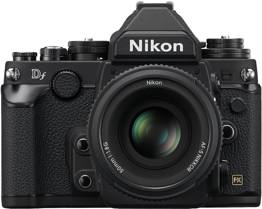
Here’s the actual Df

I like that retro styling is becoming a way for camera makers to demonstrate their commitment to serious photography, because pretty cameras are pretty, but mostly because physical knobs and dials are often better than menus for common camera functions.

But as great as these physical UI elements look, what really matters is how they feel. As I wrote back in 2008, we should not lust after specs or superficial qualities of a camera, but instead seek the most transparent possible liaison between our artistic intent and the images we want to make.

No one who hasn’t touched a Df knows how it fares on that front. So I turned, as I often do, to my buddy Gordon Laing and his amazing Camera Labs site. He spent some time with the Df at a recent Nikon press event.

Retro styling is all about nostalgia, but industries move on for a reason. So in order to be successful with a retro concept, I believe you have to serve it with a generous dollop of the modern too. Trouble is, this is not always an easy balance to get right.

Gordon seems to conclude that Nikon didn’t quite get it right. For myself, I’ve concluded that I already own an expensive, hefty, full-frame DSLR—and while it might not look hipster-retro, it feels great, and using it is second nature to me. Upon closer inspection today, I was reminded that it is, in fact, covered with knobs and dials.

Oh, and it shoots video too, which the Df does not. And it has more megapixels, and a faster shutter, and a dial that adjusts shutter speed in 1/3 stop increments (instead of full-stop), because it’s designed to work well, not just look cool.

The same can be said for Nikon’s D800, which beats out the 5D Mark III in many comparisons.

I love my big old 5D Mark III, but I am not immune to the allure of a retro body. For me, the right choice there is something very different from my interchangeable lens photography experience. Earlier this year, I bought a Fujifilm X100S. It’s a 16MP APC-C camera with a fixed 23mm ƒ2.0 lens that sells for “only” $1,300. It’s small enough that I take it places I wouldn’t take my DSLR (such as a wedding at which I’m the best man), it makes nice pictures, and while it’s nice that it looks great, it’s even better that it feels great. And to me, it nails that retro/innovation balance that Gordon so eloquently described. It has focus peaking for manual focus assist (a feature that requires stills camera makers to step outside their comfort zone and adopt something every video shooter knows is great), and a clever hybrid viewfinder that’s always the first thing I show off when folks are curious about the camera.

I’m not accusing Nikon of stepping over the fashion/functionality line with the Df. That’s a decision that every photographer should make for themselves, preferably by feel. I’m honestly thrilled that companies like Nikon, Fuji, and Sony are competing for turf that used to be owned expensively and complacently by Leica. There are now numerous ways to bring a physical, retro feel to your photography experience, and much to consider before you spend your modern dollars.

I won’t be buying the Df, but if you do, consider using this link to support the site.

Monday
May062013

Color Correcting Typewriters

The promo video for Slugline was a fun opportunity for me to try my hand at (AKA rip off) the “show, don’t sell” style of my hipster pitchman idol Adam Lisagor, as well as a chance to bust out some DV Rebel production tricks, such as stealing shots in plain sight, and approaching cinematography as an informed collaboration between the shoot and the color grade.

The opening shot features a row of typewriters, culminating in a MacBook Air. I shot it at California Typewriter in Berkeley. If an honest-to-goodness typewriter store sounds like a cool thing to you, then this place is your Shangri-La. Father-daughter proprietors Herb and Carmen gave me free run of their shop for an hour before they opened.

Here was my gear:

“Lighting control” is a fancy term for my humble request of Carmen to turn off the overhead fluorescents. But the Nasty Flag really did help me kill the fill from a skylight above my first typewriter.

I shot at 29.97 fps, knowing I’d slow the footage down to 23.976 in the cut. Shooting 30-for–24 helped smooth out my hand-operated slider move (a little). I was matching to an animatic with locked VO, so I knew how long my shot had to be—but I had to do a little math to account for the slowdown.

I did my best to stage the shot in a spot with decent lighting, but there was only so much I could do. So I shot flat, made sure not to clip, and started thinking about how I’d finish my job as cinematographer in After Effects CS6, using Magic Bullet Colorista II.

The solution wound up emerging from the visual effects component of the shot. To replace the screen on the MacBook Air, I used the After Effects 3D tracker. The results were solid throughout the shot, so I began experimenting with adding color correction masks in 3D space. Here’s how you do that:

  1. Select several points on the plane of the surface you wish to re-light
  2. Right-click and select Create Solid
  3. Preview and verify that the solid you’ve created “sticks” to the surface
  4. If it’s tracking well, enlarge the solid to generously cover the surface, and then sculpt your color correction mask using the After Effects masking tools.
  5. You may still have to add keyframes to the mask shape to ensure accuracy, but it should only take a few.
  6. Use the result as a Track Matte for an Adjustment Layer containing your color correction.

As you can see, I wound up with 3D masks to control the brightness of the keyboards on two typewriters, the shadowing of the back wall, and, most importantly, the sheen on the MacBook Air. Before I added that gleam to the lower surface of the laptop, the shot was simply not telling the story.

When you are the director, DP, and colorist, the sin of “fix it in post” is no sin at all—as long as you don’t write any checks on the set that you lack the chops to cash in post. Would the shot look better if I’d lit it properly and gotten the look in 100% camera? Of course—but that’s a useless hypothetical. Thanks to the kindness of some strangers, I had an opportunity to get my shot for free, based on the promise that I’d be low-impact and quick. If I’d shown up with a lighting kit, asking to tie into their power and block access to parts of their store, my hosts would, quite rightly, start thinking about charging me a location fee. And there’s no way I’d have been in and out in an hour. So I made use of the resources I had—which included a brief window to shoot in a very cool location, a heck of a lot more time at my computer later, and a personal predilection for elaborate color grading tricks.

I budgeted my hour at the location almost perfectly—which wound up meaning “perfectly wrong.” Just as I was reliably getting good takes, the clock struck noon, and Carmen opened the door to a customer who’d been waiting patiently outside with his busted, beige printer from the late Paleolithic era. Right near the end of my best take, a reflection from the swinging door pinged the shelf in a distracting way. So I fixed that too, by pulling bits of shelf from adjacent frames.

Gosh, you’ve really got some nice toys here.

In the time it took me to pack up my modest gear and put the typewriters back where I’d found them, Carmen had diagnosed the gentleman’s problem. His printer, from 1992, was skipping due to a bad belt. She dug up a replacement and had it working before I left the store.

The whole premise of Slugline is to bring screenwriting away from a software experience and back to a writing one—even a purely typing one. I realized in that moment that I’d truly found the perfect location for my opening shot.

I’ll return to California Typewriter. I’ll let you know which one I buy.

Tuesday
Apr102012

Prolost Flat

For shooting video, I’ve set up every Canon HDSLR I’ve owned the same way since the very beginning, and the 5D Mark III is no different.

  • Start with the Neutral Picture Style
  • Set Sharpness to zero—all the way to the left
  • Set Contrast all the way to the left
  • Set Saturation two notches to the left

That’s it. That’s Prolost Flat—the Picture Style of choice for Vincent Laforet, Philip Bloom, Jason Wingrove, and many others.

Prolost Flat FAQ

How did you come to these settings? How do you know they’re right?

They’re not “right,” they’re just good. Prolost Flat has been tested the only way I care about—by shooting stuff and trying to make it look great.

What about [some other custom picture style]?

It’s probably great. But it is possible to over-think this stuff, and there is such a thing as too flat.

All we’re trying to do here is bring back everything the camera has to offer in an easy-to-color-correct package. To put it another way, what you want from a flat profile is to eliminate the contrast s-curve that the most Picture Styles bake into the footage. Some custom Picture Styles go so far beyond “flat” that they actually invert this curve. This not only makes the image harder to grade, it can cause quantizing and compression artifacts to show up right in the middle of your tonal range, where they’re most noticeable.

What about log? Isn’t log the best transfer function for grading?

Yes. And in particular, Technicolor CineStyle is very nice. If you like it too, please do use it. It’s great.

But without meaning any disrespect to the folks at Technicolor, there’s one big reason why you might not want to use their Picture Style. Prolost Flat can be set up in seconds on any Canon HDSLR, in the field, without any cables, computers, or downloads. What if your camera dies on a remote shoot and you rent a replacement? Or a friend shows up with his 7D and offers it as a B camera? Or you need to work with footage from another crew? Prolost Flat is always available and works on every Canon HDSLR. It’s easy to set up and you can coach someone through the process over the phone, or even in a text message.

I’ve heard a lot of people use Prolost Flat, but bump up the sharpness a bit. Canon HDSLR video is so soft, isn’t a little sharpening a good idea?

Yes. But not in camera. Never use in-camera sharpening.

  • It tends to be of a poorer quality than what you can do in post.
  • It’s very difficult to monitor and set up accurately in the field. What looks good on a portable LCD might look hideous back in the grading suite in your calibrated, 1080p display.
  • Different scenes can benefit from amounts of sharpening. What worked on the low-contrast charts at your test bench might create horribly over-sharpened results with a high-contrast exterior shot.
  • Baking sharpening into your footage is as permanent as a bad tattoo. On your face. Better to give yourself the option to dial it in later, under controlled circumstances, using the amazing array of powerful post-production tools available.
  • Different output media require different amounts of sharpening. The sharpening you use for a YouTube upload will be different than what you want for a broadcast master, which will be different than a Blu-ray master.

In the slideshow below, you can see one example of sharpening using the After Effects Unsharp Mask effect, with an Amount of 120 and a Radius of 1.1. You can download full-res comparison frames here.

But doesn’t in-camera sharpening happen before compression? If I’m sharpening in post, aren’t I also sharpening and enhancing compression and noise?

Yes. But in-camera sharpening is such a blunt instrument that even its privileged position of operating prior to compression can’t save it.

A light pass of noise reduction from something like Magic bullet Denoiser II not only cleans up some compression artifacts, it also can promote your 8-bit footage to higher color fidelity by interpolating new, high-bit-depth pixels. So your HDSLR processing pipeline should look like this:

  1. In a 16 or 32bpc environment…
  2. Reduce noise
  3. Visual effects, if any
  4. Color correct
  5. Sharpen
  6. Add back some noise/grain to taste
  7. Titles or graphics, if any

Sharpening is a perceptual exercise. You want to sharpen what the viewer sees. So it’s critical that sharpening be performed after color correction.

Everyone says the 5D Mark III’s video is even softer than the Mark II’s. Maybe just a little in-camera sharpening?

No. The Mark III’s softness is simply the lack of artificial sharpness that came from the aliasing that plagued the 5D Mark II. This means that the footage takes sharpening in post even better than 5D Mark II footage, because there are fewer inherent artifacts to bring out.

It would be nice if the 5D Mark III resolved more detail than it does (there is plenty of room for improvement there), but adding in-camera sharpening won’t make that dream a reality. It only adds permanent, ugly artifacts to your image.

Cool. I’m just going to bump up the sharpening by one tick. Sorry.

Are you sure you wouldn’t be better off with a hacked GH2?

One last strike against in-camera sharpening: It limits your ability to add additional sharpening in post. You don’t want to sharpen sharpening artifacts. You can see in the below comparison how even one notch of Sharpness adds ringing artifacts that will make sharpening in post problematic. These are 1:1 crops—you can download an archive of the full-res frames here.

I’m just a shooter and don’t always have control over what happens to my footage. I like to add sharpness so my clients don’t complain about soft footage. My children need wine!

You might also want to re-think shooting flat then. Prolost Flat is designed to be graded—and specifically, graded underneath an s-curve. If you’re not going to be around to see this done properly, you might not be pleased with how your footage winds up looking in the final conform.

What about Highlight Tone Priority?

Highlight Tone Priority is an optional method Canon uses to capture more highlight detail by “pushing” the ISO one stop. The result is one extra stop of highlight detail (roughly), coupled with one extra stop’s worth of noise (also roughly).

When I first posted about Prolost Flat, I recommended using HTP for bright scenes with difficult highlights. But since then, I’ve completely stopped using it. The benefits don’t tend to outweigh the risks. And by “risks,” I mean that you might leave HTP on and shoot a bunch of raw stills, and wonder why they don’t look as nice as they should in Lightroom. Unlike other settings discussed here, HTP does affect raw stills. Oops.

Speaking of which, what happens if I leave my HDSLR set to Prolost Flat when I shoot stills?

JPEG shots and the embedded JPEG preview in raw files (what you see on the camera’s LCD when chimping) will be created using the Picture Style. But of course, the actual image date in the raw file is unaffected. And of course you’re shooting raw, right?

I leave my cameras in Prolost Flat all the time, even for stills. If find that the flat preview image gives me a better sense of the actual raw “negative” that I’m capturing. The only thing you have to get used to is that it’s easy to underexpose slightly if you judge exposure by the preview image, as the Prolost Flat preview looks a touch brighter than most default raw processing.

What’s the right s-curve to use?

The one that looks best to you. All I’ll suggest is that you use the same one from shot to shot.

You can watch me setting up some s-curves and grading under them in my Colorista II tutorials and my demonstration of color correcting food photography.

Share this article using the url prolost.com/flat

Tuesday
Mar202012

Canon 5D Mark III Graded

Dan Chung posted some camera-original clips from his new 5D Mark III. I grabbed one and did a quick color correction. 

To my eye, in this highy subjective and non-conclusive test, the footage holds up better under extreme adjustments than that of the 5D Mark II.

Shot with a production 5D mkIII in 1080/24P, 24-105mm f4L, 5000ISO , Standard picture style, regular Noise reducion.