


Prolost Flat
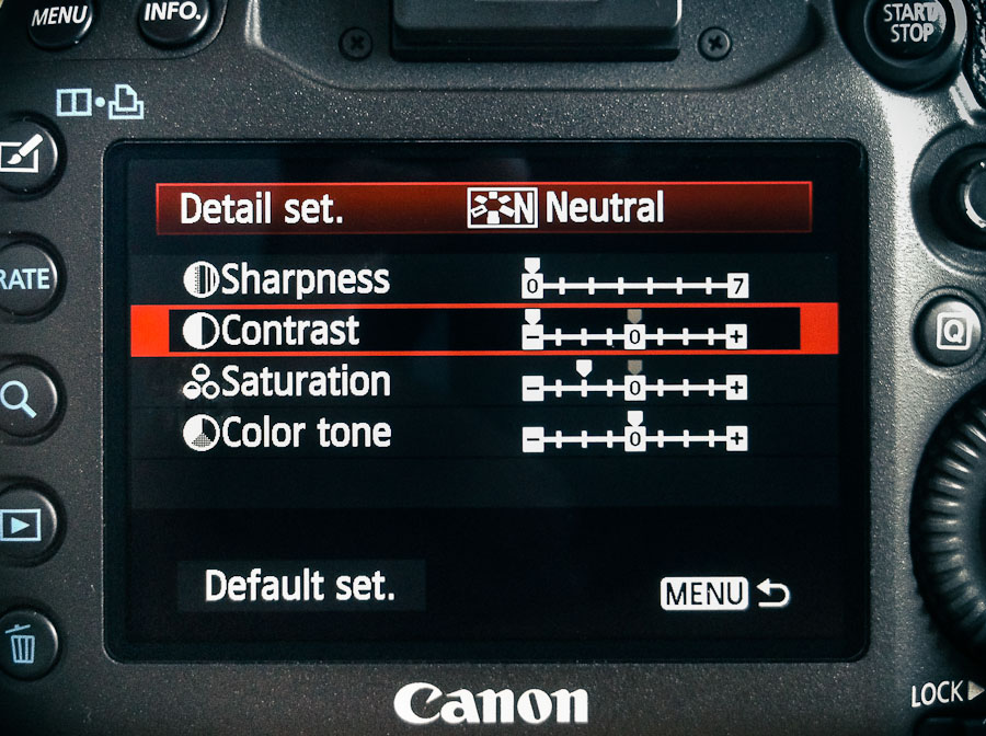
For shooting video, I’ve set up every Canon HDSLR I’ve owned the same way since the very beginning, and the 5D Mark III is no different.
- Start with the Neutral Picture Style
- Set Sharpness to zero—all the way to the left
- Set Contrast all the way to the left
- Set Saturation two notches to the left
That’s it. That’s Prolost Flat—the Picture Style of choice for Vincent Laforet, Philip Bloom, Jason Wingrove, and many others.
Prolost Flat FAQ
How did you come to these settings? How do you know they’re right?
They’re not “right,” they’re just good. Prolost Flat has been tested the only way I care about—by shooting stuff and trying to make it look great.
What about [some other custom picture style]?
It’s probably great. But it is possible to over-think this stuff, and there is such a thing as too flat.
All we’re trying to do here is bring back everything the camera has to offer in an easy-to-color-correct package. To put it another way, what you want from a flat profile is to eliminate the contrast s-curve that the most Picture Styles bake into the footage. Some custom Picture Styles go so far beyond “flat” that they actually invert this curve. This not only makes the image harder to grade, it can cause quantizing and compression artifacts to show up right in the middle of your tonal range, where they’re most noticeable.
What about log? Isn’t log the best transfer function for grading?
Yes. And in particular, Technicolor CineStyle is very nice. If you like it too, please do use it. It’s great.
But without meaning any disrespect to the folks at Technicolor, there’s one big reason why you might not want to use their Picture Style. Prolost Flat can be set up in seconds on any Canon HDSLR, in the field, without any cables, computers, or downloads. What if your camera dies on a remote shoot and you rent a replacement? Or a friend shows up with his 7D and offers it as a B camera? Or you need to work with footage from another crew? Prolost Flat is always available and works on every Canon HDSLR. It’s easy to set up and you can coach someone through the process over the phone, or even in a text message.
I’ve heard a lot of people use Prolost Flat, but bump up the sharpness a bit. Canon HDSLR video is so soft, isn’t a little sharpening a good idea?
Yes. But not in camera. Never use in-camera sharpening.
- It tends to be of a poorer quality than what you can do in post.
- It’s very difficult to monitor and set up accurately in the field. What looks good on a portable LCD might look hideous back in the grading suite in your calibrated, 1080p display.
- Different scenes can benefit from amounts of sharpening. What worked on the low-contrast charts at your test bench might create horribly over-sharpened results with a high-contrast exterior shot.
- Baking sharpening into your footage is as permanent as a bad tattoo. On your face. Better to give yourself the option to dial it in later, under controlled circumstances, using the amazing array of powerful post-production tools available.
- Different output media require different amounts of sharpening. The sharpening you use for a YouTube upload will be different than what you want for a broadcast master, which will be different than a Blu-ray master.
In the slideshow below, you can see one example of sharpening using the After Effects Unsharp Mask effect, with an Amount of 120 and a Radius of 1.1. You can download full-res comparison frames here.
But doesn’t in-camera sharpening happen before compression? If I’m sharpening in post, aren’t I also sharpening and enhancing compression and noise?
Yes. But in-camera sharpening is such a blunt instrument that even its privileged position of operating prior to compression can’t save it.
A light pass of noise reduction from something like Magic bullet Denoiser II not only cleans up some compression artifacts, it also can promote your 8-bit footage to higher color fidelity by interpolating new, high-bit-depth pixels. So your HDSLR processing pipeline should look like this:
- In a 16 or 32bpc environment…
- Reduce noise
- Visual effects, if any
- Color correct
- Sharpen
- Add back some noise/grain to taste
- Titles or graphics, if any
Sharpening is a perceptual exercise. You want to sharpen what the viewer sees. So it’s critical that sharpening be performed after color correction.
Everyone says the 5D Mark III’s video is even softer than the Mark II’s. Maybe just a little in-camera sharpening?
No. The Mark III’s softness is simply the lack of artificial sharpness that came from the aliasing that plagued the 5D Mark II. This means that the footage takes sharpening in post even better than 5D Mark II footage, because there are fewer inherent artifacts to bring out.
It would be nice if the 5D Mark III resolved more detail than it does (there is plenty of room for improvement there), but adding in-camera sharpening won’t make that dream a reality. It only adds permanent, ugly artifacts to your image.
Cool. I’m just going to bump up the sharpening by one tick. Sorry.
Are you sure you wouldn’t be better off with a hacked GH2?
One last strike against in-camera sharpening: It limits your ability to add additional sharpening in post. You don’t want to sharpen sharpening artifacts. You can see in the below comparison how even one notch of Sharpness adds ringing artifacts that will make sharpening in post problematic. These are 1:1 crops—you can download an archive of the full-res frames here.
I’m just a shooter and don’t always have control over what happens to my footage. I like to add sharpness so my clients don’t complain about soft footage. My children need wine!
You might also want to re-think shooting flat then. Prolost Flat is designed to be graded—and specifically, graded underneath an s-curve. If you’re not going to be around to see this done properly, you might not be pleased with how your footage winds up looking in the final conform.
What about Highlight Tone Priority?
Highlight Tone Priority is an optional method Canon uses to capture more highlight detail by “pushing” the ISO one stop. The result is one extra stop of highlight detail (roughly), coupled with one extra stop’s worth of noise (also roughly).
When I first posted about Prolost Flat, I recommended using HTP for bright scenes with difficult highlights. But since then, I’ve completely stopped using it. The benefits don’t tend to outweigh the risks. And by “risks,” I mean that you might leave HTP on and shoot a bunch of raw stills, and wonder why they don’t look as nice as they should in Lightroom. Unlike other settings discussed here, HTP does affect raw stills. Oops.
Speaking of which, what happens if I leave my HDSLR set to Prolost Flat when I shoot stills?
JPEG shots and the embedded JPEG preview in raw files (what you see on the camera’s LCD when chimping) will be created using the Picture Style. But of course, the actual image date in the raw file is unaffected. And of course you’re shooting raw, right?
I leave my cameras in Prolost Flat all the time, even for stills. If find that the flat preview image gives me a better sense of the actual raw “negative” that I’m capturing. The only thing you have to get used to is that it’s easy to underexpose slightly if you judge exposure by the preview image, as the Prolost Flat preview looks a touch brighter than most default raw processing.
What’s the right s-curve to use?
The one that looks best to you. All I’ll suggest is that you use the same one from shot to shot.
You can watch me setting up some s-curves and grading under them in my Colorista II tutorials and my demonstration of color correcting food photography.
Share this article using the url prolost.com/flat
 34 Comments
Reader Comments (34)
Hi Stu, I been using the same technic (denoise, color, sharpen, render to tiff) for a while, it´s incredible the difference you can do with any footage. I also have been trying the "reduce Interlace flicker" filter for fixing those jagged edges but it also makes the image soft again(a little bit) is there any recomendation of how much using this you can give?
PD: liked to know your sharpening in post set( amount and radius).
Sorry for my english... :P
"Are you sure you wouldn’t be better off with a hacked GH2?"
Hilarious. I want this on a shirt so I can just point to it instead of saying it over and over.
Hi Matias, some sharpening settings for you to try are included above in the sharpening sideshow.
Good write up Stu, thanks for sharing.
A while back I did a comparison between using in camera sharping at the default setting to no in camera and sharpening in post. I asked everyone guess which one was which in the comments and at the end I told them that "A" In camera sharpening at +3, and "B" In camera at 0 with post sharpening added.
http://www.learningdslrvideo.com/camera-sharpness-the-devil/
I totally up the comments on my blog, Vimeo and Youtube:
- 24 for "A" In camera sharpening at +3
- 26 for "B" In camera at 0 with post sharpening added.
- 7 couldn't tell a difference
That test was done on my Canon T2i.
Now the interesting thing is I am comparing the Canon 5D Mark III to the D800 right now and I am finding that the 5D3 sharpening at +3 is too sharp compared to the T2i (same lenses).
But it is early and I have only used the 5D3 for a couple of weeks so we will see.
Just thought you might find that interesting.
I bet you have a very good eye for this and could figure out my test right away.
Dave
First of all, sorry: I do know I'm being a bit too pushy. I reserve this kind of public harassment for blogs in my morning bookmarks. ♥
And now... did you get to try my Flaat profiles?
* they're getting great feedback:
https://twitter.com/#!/sherifmokbel/status/189447256640995329
https://twitter.com/#!/CameraRick/status/181130291639885824
https://twitter.com/#!/CameraRick/status/181447918509764608
http://www.dvxuser.com/V6/showthread.php?262094-Adventures-in-the-PSE&p=1986113269&viewfull=1#post1986113269
http://www.similaar.com/foto/flaat-picture-styles/real-world-tests-3.html
* they're not "too flat"; actually you get to choose how much contrast / DR you get, Flaat_09 is a bit narrower than Prolost Flat, Flaat_12 is a lot wider
* they're not "overthought", maybe I should send you the editable PSE files so you can see how simple they are: it's just the light response that you're looking for ("what you want from a flat profile is to eliminate the contrast s-curve that the most Picture Styles bake into the footage"), precisely calibrated, and giving you more options: you get to choose between the colors of Portrait (nicer skin tones) or Neutral (no color shifts), both with exactly the same light response; and you get to choose how wide you want to spread your color space, DR wise (from 9 to 11.5 stops)
You do need a computer, cables, etc, to install it into a camera, though.
http://www.similaar.com/foto/flaat-picture-styles/index.html
Right there with you Dan. I'm so glad that the intra gh2 exists, as I have been able to stop caring about camera, and really get enthused for story. (though that new fs700 still has the upper hand on slo mo, & I do crave that 240... I'll rent it)
Samuel, I really appreciate the thought and effort you've put into creating your profiles. But I imagine you understand that you have an enthusiasm and appetite for creating and testing Picture Styles that most mortal humans do not. So no, sadly, I have not had a chance to try your 24 different Pictures Styles, each perfectly optimized for a slightly different situation.
It's just too much choice. It's 23 opportunities to pick the wrong profile.
The best thing Technicolor did with CineStyle was to pick one setting and stick with it. Just like Panavsion did with Panalog and Arri did with Log C. And like Red initially failed to do with the Red one, with dire consequences.
Again, I don’t want to besmirch the good work you've done. But if you want some insight into how people react when presented with a bewildering array of options, I highly recommend that you follow the first two links in my Paradox of Choice post about how the Canon C300 fits into the Super 35 camera market.
My deep appreciation for this affliction of too much choice is exactly why I wrote this post—I always regretted that my original Prolost Flat post had too much equivocation about things like HTP. I wanted to present a canonical record of what Prolost Flat is.
If you are feeling generous, you can call me obsessed with simplicity. If not, you can call me lazy. Either way, you'd be right.
Stu>Great and timely post especially considering all the negative feedback and workarounds for the 5dmkIIIs 'soft' image.
I still use and love Technicolor, as well as HTP in high contrast situations, but agree that Prolost Flat is a great alternative.
If your CC and post work is in AE and the last step is sharpening, would you simply make sure your sharpen filter is the last(bottom most) filter in your stack and-or applied to the top most adjustment layer?
Thanks a lot for the answer, Stu.
I understand your concerns, and can assure you that you're not the only one suffering from that paradox of choice when confronted with my Flaat profiles.
But I like choice. I like to use the best tool for the job, and to fine tune that tool for that job too. And these profiles were initially made for myself, so they follow my tastes.
In particular, given the crappy codec in these cameras, I like to have a suite of picture styles so that all the footage looks similar, but I can fine tune how much DR I want to cram into the codec's color space for each shot, without ever losing the near-log light response and going for a baked-in s-curve that's difficult to grade.
I thought you'd like them, because they closely follow much of the philosophy you exposed, for example, in this post. But I also understand that, in any case, one of the main benefits of Flaat (easy to grade, specially for skin tones) is a lot bigger for me than for a color master like you.
And again: thanks a lot for the reply, I'll sleep a lot better knowing that it's not that you tried them, found them unbearable, and were too polite to comment.
Wanted to add that some people reserve turning sharpening all the way down for green screen work only to avoid edge artifacts, but otherwise dial in 1 or 2 clicks.
Yes Jim, and those people are doing it wrong.
I have been finding it hard to get a good resource on picture styles like this. Thanks so much, Stu!
However, I am also looking for something that I can grade, but will also stand on its own if needed. Any suggestions for shooting outside of standard, but in a pinch be able to use footage directly out of the camera? Maybe turn sharpness down from the Standard picture style?
Stu, about the Sharpening process, which plugin is best when editing in FCP7? I'm starting to use Prolost Flat on capturing a wedding today and I've great expectations about this. Thanks.
Thanks for setting me straight on this. I just did a test for myself. Colors actually look better in trees because there are dark halos when using the in camera sharpening. Stu, do you ever use the threshold on the unsharp mask or change the radius? For instance would a video meant to play on youtube need a smaller radius sharpen filter than one that is intended to go on a DVD? Thanks!
Hey Stu, do know of any links to some good colour correction/grading tutorials that cover sharpening/noise etc. ? I have found limited info but have only just started out with this using Apple colour, not sure it's any good and not really liking it too much either. What programs would you recommend getting to grade etc ? Any help is much appreciated !
I just noticed your colorista tutorials above, would you recommend starting with this first ?
Shot on 5D2 and Flaat_12p:
http://vimeo.com/40618538
It would look pretty similar with the 5D3, minus the horrible aliasing/moire.
I would rate those 11.5 stops of DR as "definitely useable", at least after resampling to 720p.
Not a good choice as an everyday profile (cramming 11.5 stops of DR into an 8-bit codec will bring some issues, that's for sure), but great to have for those days when you NEED the extra 2 stops of DR (with Prolost Flat, or even CineStyle, I think the background would have been "mostly black"; I can't be sure, though, since it wasn't me shoothing this).
This so is a new Prolost shirt for the store. Ill take a yellow on a black medium.
Prolost Flat
jas
Wow Stu your name is mentioned in this video on Adobe!
http://www.adobe.com/products/premiere/switch.html
Hi, Stu. Thanks for this. Is this flat, soft look what you would also recommend for 3d renders headed for post?
Just as important as a flat overall profile is, shooting in a "correct" white balance is a HUGE step in keeping your 4:2:0 epic in the proper place for grading. You need to get into color temperatures on your set and make sure that your lights are not fighting each other for respect. EG. 5500 daylight and 4400 Home depot lights or your basic tungsten muddying up your daylight coming thru the window. White balance can make or break your shot when there is NO room to push color around like a RAW file!
When in doubt, trust that ANY sunlight is far more powerful the the lights in the room and that it's ambiance is blasting in at 5500K... so you may need to go 5500K and add back some green,amber,magenta in your custom white balance controls to get the skin tones right in the sweet spot. When your skin tones look good in the LCD, you are probably in the right spot... Do NOT just trust the presets for Day,Tungsten, Shade, Cloud, etc.... I have seen the difference in post on my latest projects, and its a night and day difference in the quality of the work.
Always be aware of the "quality" of your light!
Hi Stu,
If you or anyone want to try yet another Canon picture profile, I've recently completed my high dynamic range profile after much testing and refinement. Unlike Technicolor's Cinestyle it uses all of the codec's 8 bit values for encoding and retains the camera's native chroma sampling. The result is overall less banding and maximum dynamic range. I'll let the charts on the link below speak for themselves but hope you or others find it useful.
http://www.coreyrobson.com/post/21203712633/another-canon-dslr-picture-profile
I'm curious about setting up an S-curve. Should it be done in RGB or in Y'CbCr? I was taught that expanding contrast in RGB will increase saturation while doing so in Y'CbCr will decrease saturation. Ideally, we want to do the opposite of whatever the camera did when we set the settings to be flatter. My first impulse is to assume that it's working in RGB space, but I'm not really positive of that. Do you happen to know?
I don't know about the "contrast" value, but I know that the curves you add on the picture style definition don't affect saturation, just brightness (i.e. they're perfectly counteracted by Premiere's "luma curve" effect)
OK, well "Luma Curve" would suggest it's in Y'CbCr space. I'll check it out.
The curve should be in RGB. In this case, the changes in saturation across the curve are (generally) desirable. I demonstrate and describe that in this tutorial.
that's the general advice, an the method that's giving me the best results in day-to-day use
but if for some reason (note: there has to be a reason, and it may not be easy to find one) you want to undo what the picture style is doing, then the tool is the luma curve (at least to undo what the curve in the picture style is doing; I still haven't tested with the "contrast" parameter)
BTW: music video shot on Flaat, with some very impressive high DR shots:
http://www.similaar.com/foto/flaat-picture-styles/real-world-tests-8.html
In Premiere Pro should I apply the curve BEFORE the grading, or after?
I used to grade my DVCPROHD footage applying effects in this order (from top to bottom)
1) White Balance (fast color corrector)
2) Three Way Color Corrector(s)
3) RGB curves
Should I keep this order when working with footage shot with a Canon 5D with this FLAT setting?
Curve last.
Hi all,
is there any kind of LUT to use with the Prolost Flat PS in post, the same you can do with Cinestyle?
See "What's the Right S-curve to Use" above.
Hey Stu, great blog! I initially came to this site for this article but then found myself reading the entire site over my Christmas break. I'm not sure how often you check this article, I know I'm late to the party. Anyway, here is my question:
After purchasing a Canon EOS-M body, for video and for under $200, I wanted to utilize its functions to the best of my, and its, abilities. When I happened upon your article on Prolost Flat, I was definitely intrigued. Needless to say, I am more than happy with the outcome.
Actually, here's the question:
I am going to NYC for work, and do not want to lug my camera set up on the bus and through the streets just to get a few exterior shots, so I have decided to bring my little Canon A1200 point & shoot (the project I am working on will be using multi media that is integrated into the concept) Anyway, the A1200 has a custom picture profile, initially I was dropping everything down including the saturation... Should I be splitting the difference, with saturation, with a point and shoot like I would with a DSLR/Mirrorless?
Thanks and Happy New Year!!!
Glenn
Hi Glenn!
I can't say exactly what would be best, but the reason for reducing the saturation is to prevent any one channel from getting clipped with saturated colors, and to allow a natural saturation to be restored when an s-curve is applied in post. So drop down your saturation a touch, test, and proceed!
Hey Stu,
Thanks for the quick reply. Obviously, I am figuring this all out as I go, and it's sites like yours that help people like me... just make a movie. I am not a colorist, and your little pointers are very helpful.
Keep Fighting the Good Fight!!!
Glenn