Tools

Slugline. Simple, elegant screenwriting.

Red Giant Color Suite, with Magic Bullet Looks 2.5 and Colorista II

Needables
  • Sony Alpha a7S Compact Interchangeable Lens Digital Camera
    Sony Alpha a7S Compact Interchangeable Lens Digital Camera
    Sony
  • Panasonic LUMIX DMC-GH4KBODY 16.05MP Digital Single Lens Mirrorless Camera with 4K Cinematic Video (Body Only)
    Panasonic LUMIX DMC-GH4KBODY 16.05MP Digital Single Lens Mirrorless Camera with 4K Cinematic Video (Body Only)
    Panasonic
  • TASCAM DR-100mkII 2-Channel Portable Digital Recorder
    TASCAM DR-100mkII 2-Channel Portable Digital Recorder
    TASCAM
  • The DV Rebel's Guide: An All-Digital Approach to Making Killer Action Movies on the Cheap (Peachpit)
    The DV Rebel's Guide: An All-Digital Approach to Making Killer Action Movies on the Cheap (Peachpit)
    by Stu Maschwitz

Entries in Visual Effects (84)

Wednesday
Sep302009

Passing the Linear Torch

I used to show you weird crap like this all the time

Back in the day I blogged a lot about how compositing and rendering computer graphics in “linear light.” a color space in which pixel values equate to light intensities, can produce more realistic results, cure some artifacts, and eliminate the need for clever hacks to emulate natural phenomena. Along with Brendan Bolles, who worked with me at The Orphanage at the time, I created eLin, a system of plug-ins that allowed linear-light compositing in Adobe After Effects 6 (at the mild expense of your sanity). I also created macros for using the eLin color model in Shake and Fusion. Along the way I evangelized an end to the use of the term linear to describe images with a baked-in gamma correction.

Then Adobe released After Effects 7.0, which for the first time featured a 32-bit floating point mode, along with the beginnings of ICC color management, which could be used to semi-automate a linear-light workflow. The process was not exactly self-explanatory though, so I wrote a series of articles (1, 2, 3, 4, 5, 6) on how one might go about it.

Then I rambled endlessly on fxguide about this, and in the processes managed to cast a geek spell on Mike Seymour and John Montgomery, who republished my articles on their fine site with my blessing.

This week Mike interviewed Håkan “MasterZap” Andersson of Mental Images about the state of linear workflows today on that same fxguide podcast.

Which is so very awesome, because I don’t want to talk about it anymore.

It’s just no fun going around telling people “Oh, so you put one layer over another in After Effects? Yeah, you’re doing it wrong.” Or “Oh, you launched your 3D application and rendered a teapot? Yeah, you’re totally doing it wrong.”

You are doing it wrong. And I spent a good few years trying to explain why. But now I don’t have to, because Mike and MasterZap had a great conversation about it, and nailed it, and despite the nice things they said about ProLost you should listen to their chat instead of reading my crusty old posts on the subject.

Because it has gotten much, much simpler since then.

For example, there’s Nuke. Nuke makes it hard to do anything but work in linear color space. Brings a tear to my eye.

And the color management stuff in After Effects has matured to the point that its nearly usable by mortal men.

Since I’ve seen a lot of recent traffic on those crusty old posts, here’s my linear-light swan song: a super brief update on how to do it in AE CS4:

In your Project Settings, select 32 bpc mode, choose sRGB as your color space, and check the Linearize Working Space option:


When importing video footage, use the Color Management tab in Interpret Footage > Main to assign a color profile of sRGB to your footage:


Composite your brains out (not pictured).

When rendering to a video-space file, use the Color Management tab in your Output Module Settings to convert to sRGB on render:

That’s the how. For the why, well, those crusty old articles could possibly help with that, especially this one on color correction in linear float, and this one on when not to use linear color space. Part 6 is still pretty much accurate in describing how to extract a linear HDR image from a single raw file using Adobe Camera Raw importer in After Effects, and this article covers the basics fairly well, although you should ignore all the specifics about the Cineon Emulation mode, which never should have existed. This little bit of evangelism is still a good read.

But the ultimate why answer is, and has been for a while now, within the pages of a book you should have anyway: Adobe After Effects CS4 Visual Effects and Compositing Studio Techniques (deep breath). Brendan Bolles guest-authored a chapter on linear light workflow, and not only does he explain it well, he gives many visual examples. And unlike me, Mark keeps his book up-to-date, so Brendan’s evergreen concepts are linked directly to the recent innovations in After Effects’s color manglement.

OK, that’s it. Let us never speak of this again.

Thursday
Jul092009

fxphd July09 Term, AKA Show You My O-Week

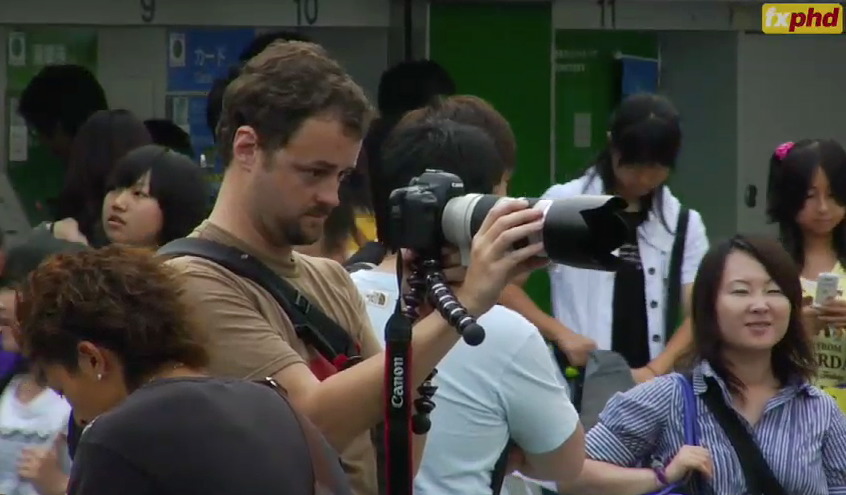
Registration is now open for the new July09 Term of fxphd, the most in-depth visual effects training you can find. This term I’m joining Mike Seymour in teaching a course on DSLR cinematography, for which Mike, John Montgomery, and I traveled to Japan to train our lenses on some of the most tantalizing and notoriously film-unfriendly settings on the planet.

The double-chin is due to either the awkward pose or all the amazing food we ate—possibly both.

Here you see me hand-holding my Canon 5D Mark II with Mike’s Canon 70–200 f/2.8L IS in Tokyo’s teen fashion capital, Harajuku. This ill-advised activity is made somewhat more tolerable by the funky support rig I’ve created by bending my Gorillapod GP8 (the badass metal one — coolest thing I’ve added to my kit in months) into an outrigger that lets me support some of the lens’s weight with my focus-pulling arm.

Mike has a couple of updates (first, second) on his Dean’s Blog, and there’s a terrific “o-week” video (right-click to download) that provides a sneak peek at some of what we shot and how we shot it, as well as teasers for the amazing array of other classes in the term.

If you can’t tell, I’m a (somewhat biased) fan of fxphd. Mike, John, and their worldwide team of professors give you the good stuff, the likes of which I’ve not seen anywhere else. If you want to learn visual effects from real artists working in the field, fxphd is the place to do it.

Complete course listing for the July09 term here.

Wednesday
Feb182009

Venomocity

Last year I had the great fun of working with the Phoenix-based agency Riester on a series of three anti-smoking spots for the Arizona Bureau of Tobacco Education and Prevention. The finished spots were held up briefly, but finally airing in Arizona. Here are all three—click through to view them in fancy YouTube HD (link is below and to the right of the movie)!

You may notice that some of the footage appears to be hand-cranked. In fact, the entire spot was shot on the Panavision Genesis, a camera that quite prominently lacks a hand crank. So my DP (the brilliant Carlos Veron) and I shot the hand-crank sections at an even 50 fps (the Genesis's max), and then editor Gregory Nussbaum (of Pictures in a Row) and I ran the shots through the very same hand-crank After Effects project that I included in The DV Rebel's Guide.

Of course, some of the hand-cranked shots contain visual effects (supervised by Ryan Tudhope). As I told the crew at the kickoff meeting, it's not a Stu job unless we're doing something annoying with time. Ryan's animators actually worked at 50 fps on the original plate, and then rendered only the frames called for by the hand-crank retiming curve. This allowed them to be as surprised and annoyed by the hand-crank effect as the live action crew!

By shooting at 50 fps, we got smoother 24p results from the hand-crank effect, as it had more frames to pull from. You can do the same if your camera has a 60p or 60i mode (50 for PAL), as most do. All of this is explained in The Guide.

Carlos also shot wide-open much of the time. The combination of Super35 sensor, overcranking, and wide dynamic range (since we'd be shooting outdoors in direct sun) meant that the Genesis was really the only digital camera I felt we could use for this campaign. We almost didn't get one, which would have meant resorting to, gasp, film!

Orphanage colorist Aaron Rhodes graded the spots in Film Master, creating LUTs that the VFX artists used to preview their work with propper color. We used much the same workflow as we did on The Spirit.

These spots have everything I love, performance, cinematography, and a worthwhile message. I'm proud of them and delighted that I can finally share them with you. You can also watch them in their native habitat on the very cool web site developed to anchor the campaign: venomocity.com.

Thursday
Jan152009

Spirit Press: Film & Video

If you haven't heard enough about how I finally got to do that thing I was talking about, Debra Kaufman has written an excellent article for Film & Video called The Spirit Closes the Distance Between VFX and the DI.

The Spirit, directed by Frank Miller and based on the Will Eisner comic book series, points the way toward a new integration of digital production and post. That’s thanks to The Orphanage, a VFX/production company in San Francisco and Los Angeles, and its co-founder Stu Maschwitz, the movie’s second unit director and visual effects supervisor. “Every movie is a collaboration between visual effects artists and the DI artist, but they never meet and they never see each other’s work,” said Maschwitz. “They get approved in a vacuum. The colorist doesn’t get to pass any wisdom back to the VFX artist, and the VFX artist thinks, ‘We’ll color this in post.’ It’s an important collaboration that’s broken. We’re still scheduling the DI at the end of the process, approving visual effects shots before we’ve thought much about the digital intermediate."

With The Spirit, Maschwitz saw an opportunity. “I thought, here’s a chance to put my money where my mouth is,” he said. “Because of its principle creative, the movie is going to be a visual feast. I wanted to put into practice some ideas about how to better integrate those two really important processes: visual effects and DI.”

Page 1 ... 2 3 4 5 6 ... 21 Next 4 Entries »