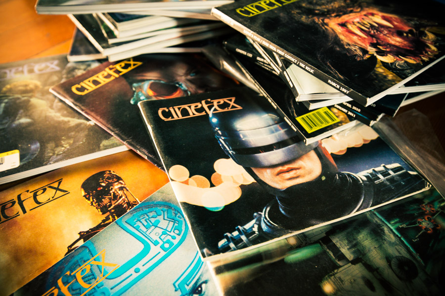
Cinefex needs your help to make something great.
The first issue of Cinefex I bought had Robocop on the cover. It was bagged and boarded at Dreamhaven Books in Minneapolis, and I remember thinking it was expensive, and really fancy. I read it cover-to-cover, not understanding much of anything I was reading. When I got to the end, I read it again.
The Robocop article still stands out as one of my favorites. I went back and read it several more times, and with subsequent issues providing context, each new reading brought new understandings. It’s not only where I learned about zirc hits and methylcellulose, but also where I learned about Paul Verhoeven’s philosophy about violence in movies, and how an MPAA-ordered cut-down of the film’s more violent scenes had the unintended effect of transforming satirical, intentionally over-the-top violence into just plain violence. This wasn’t just an article about how some visual effects were accomplished. This was a juicy, practical essay on the filmmaking process.
Cinefex is still great, but nothing they’ve printed in recent years matches the infectious, inspirational glory of the back catalog. Here are some tidbits I remember to this day:
- The elevator shaft that McClane throws the explosives down in Die Hard is a miniature, built in forced-perspective. This was, in part, to allow the model to be smaller—but the real, ingenious reason for the perspective trick was to make the explosion seem to accelerate up toward the camera.
- When filming the motion-control miniature of the flying Delorean landing in the rain for Back to the Future II, the model was covered in vaseline, which was smoothed and re-stippled with a toothbrush on every frame, to simulate the wet car being pelted by raindrops.
- Speaking of crazy stop-motion, in Robocop, ED–209’s machine-gun fire was animated by hand, as an in-camera effect. On each frame with gunfire, Tippet’s crew would shut off the set lighting and the rear projection, insert a tiny light bulb into the miniature gun barrel, hand-sculpt a cotton muzzle flash over the bulb, and re-expose the frame.
The deceptively minimal writing in these articles made these ideas and techniques seem not only understandable, but downright doable. Every issue would light a fire in my brain that could only be doused in my backyard, with a Super 8 camera, a cable release, and probably some unsafe household chemicals.

This was my education in visual effects. Cinefex is the reason I didn’t sound like an idiot when applying for film school, and for my first job.
When I landed my dream job at ILM, I thought maybe I’d “made it.” It was when I was first interviewed for a Cinefex article that I knew it was true.
Cinefex launched a great iPad version of their magazine last year, and each time I launch it, I see that floating wall of covers, and wish that I could have my dog-eared, worn-away back issues in this searchable, slick format.
And that’s exactly what they’re going to do—but they need our help.
Cinefex Classic is a Kickstarter campaign to bring the Cinefex back catalog to the iPad. There are ten days to go in the campaign, and they are close. Let’s get them to their goal so we can all have access to this amazing archive.
Update on Saturday, August 10, 2013 at 9:16AM by
 Stu
Stu
 Tuesday, May 27, 2014 at 1:26PM


