The easiest way to support Prolost is to begin your Amazon, iTunes, Mac App Store, Zacuto or B&H shopping here. You can drag those links to your bookmarks bar so you never forget. It costs you nothing and it really helps. Thanks!
In the 18 months since Canon announced the Canon 5D Mark II, you’ve written, you’ve called, you’ve left comments here and on Vincent Laforet’s blog. You politely but firmly harrassed Canon personel at trade shows. Perhaps most significantly, you put your money where your mouth is and bought 7Ds, showing Canon that 24p is even better than Bokake.
It delights me to no end to read these words in a Canon press release:
Developed following feedback from photographers and cinematographers, Firmware 2.0.3 further enhances the EOS 5D Mark II’s excellent video performance. The addition of new frame rates expands the camera’s video potential, providing filmmakers with the ability to shoot 1080p Full HD footage at 24fps (actual 23.976fps)—the optimum frame rate for cinematic video. 25fps support at both 1920x1080 and 640x480 resolutions will allow users to film at the frame rate required for the PAL broadcast standard, while the new firmware will also change the 30fps option to the NTSC video standard of 29.97fps.
I underlined a couple bits in there. Do they sound familiar? The wording is almost directly lifted from ProLost posts and my other communications with Canon.
Does it seem like I’m patting myself on the back? Well I am. But you should too. I know that, at best, I played maybe a tiny role in this. But this is a very cool thing that has happened here—we spoke, and Canon listened.
Update on Tuesday, March 2, 2010 at 11:17AM by
Stu
Looking back at the 24p for 5D campaign waged here on ProLost, something I never felt I needed to do was explain why 24p was so important, beyond simple technical compatibility. If you’re interested in an artistic discussion of the role 24 progressive frames per second plays in the look and feel of movies, check out part two of my interview by Rick Young of MacVideo. Rick asks one question—“why 24p”—and I talk for about ten minutes. Oops.
In many of my writings about color correction, both here on ProLost and in The Guide, I’ve talked about the balance between an aggressive “look” that helps tell your story through the use of a pervasive palette, tone, style, and feel; and the preservation of appealing skin tones. When grading a scene, you can push your look much further if you don’t lose track of appealing skin tones. Or, if you so desire, you can make a strong visual statement by choosing to allow your skin tones to get subsumed by your look.
The truth is, skin tones are just one of a small handful of what I call “memory colors.” Memory colors are colors that are, in the minds of your audience, inseparable from certain common objects or events. For example, the sky is so associated with blue that you might feel that you see those two words together as often as you see them individually. The same goes for green and grass.
The most basic idea of color correcting is that you are making colors correct, which is to say that you are making objects on the screen appear to be the colors that we know them to be.
The funny thing about this seemingly simple task is that it can be quite difficult. And it’s difficult for exactly the reason that it’s important.
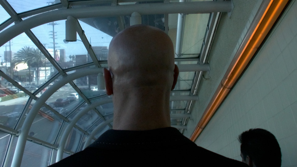
The human brain is so tied in to our eyesight that we internally auto-correct for certain colors. This is the very definition of a memory color. For example, if you grew up in the United States, you know that a stop sign is red—so you tend to see an image of one as being red even if the color is way out of whack. In the shot below, we recognize the bald head as that of a Caucasian male, even though the white balance is incorrect.
We see his head as skin-colored, even though empirically it is actually almost perfectly gray! You might not believe me, so here’s a crop of the back of his neck to prove it:
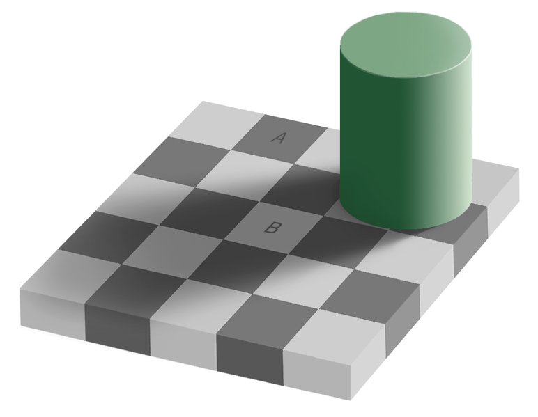
This a variation of a common optical illusion called the Same Color Illusion. We “know” that square A and B are different shades of gray “in real life,” and that knowledge prevents us from seeing that they are in fact the exact same shade in the image (click the image to see proof).
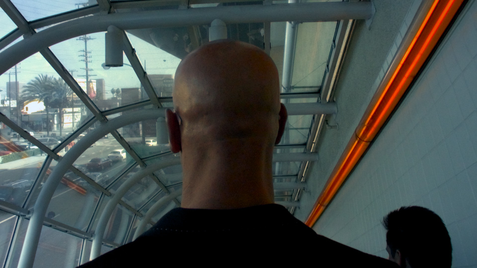
Back to the head. Even though they “know” what color it is, your audience will respond more favorably to a memory color object if their knowledge of it matches their experience, rather than fights it. And so it falls to the colorist to correct the color of the head, to make it head-colored rather than gray.
In 2008 I pointed out an example of this from the trailer for The Incredible Hulk (Steve Bowen, colorist). Edward Norton’s face appears the same color whether in a cool scene or a warm scene.
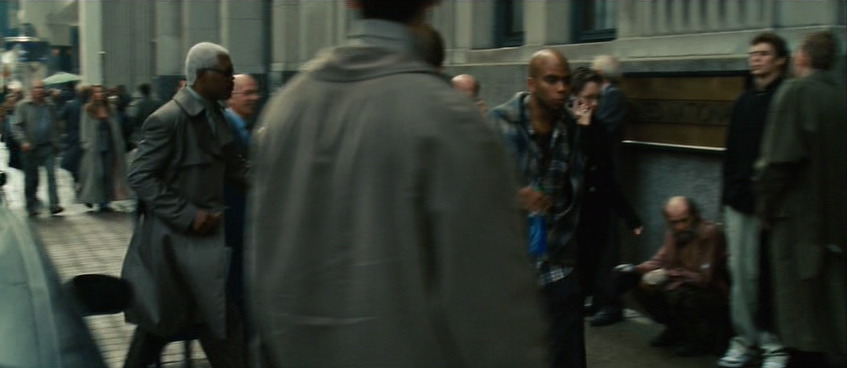
Preserving skin tones is important, but so is preserving other memory colors. Here’s a shot from Jumper (Steven J. Scott, colorist). Sam Jackson is about to walk through a crowd of people. His and their skin tones are accurate, even though their world is a faded, monochrome olive drab.
But back up a few seconds in the same shot and notice that in this faded world, brake lights are perfect, vivid red, and New York taxis read as the correct yellow-orange. This is an establishing shot, and if the grade abused the hue of the taxis too harshly, we might not read “New York” as readily.
Here’s a very short list of memory colors I try to keep in mind when coloring:
People are pink/orange (a color I like to call porange)
Grass and summer trees are green
Water and skies are blue
Fire engines, stop signs, and blood are red
You could also add just about any food to that list. Unless you’re deliberately trying to make something look unappetizing, it’s probably good to render food as accurately as possible—as I’ll show you in a moment.
I welcome your suggestions of other memory colors. And bear in mind that memory colors might vary from film to film and even scene to scene. In Stomp the Yard, there’s a scene at the beginning where almost nothing is red. Later, there’s a red jacket color so important to the story that it leaps out of every scene in which it appears.
So what’s the big deal? Objects have colors, and the colorist makes sure those things stay those colors. Easy, right?
Not necessarily. To achieve the look of that Jumper shot—where key colors pop but unimportant ones blend into a complimentary shade of blue-green—requires practice, skill, and taste. It’s hard enough under the best of circumstances, but lighting, atmosphere, bounce light, flare, camera settings, and a hundred other factors can conspire to force objects to render on-screen in colors quite unlike their real-world hues.
The good colorist first picks the memory colors important to the scene, and then ensures that they stay consistent, often combating these factors to do so.
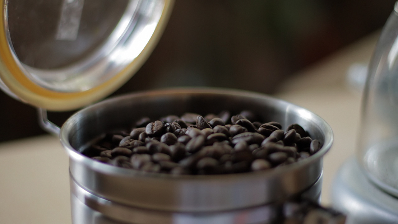
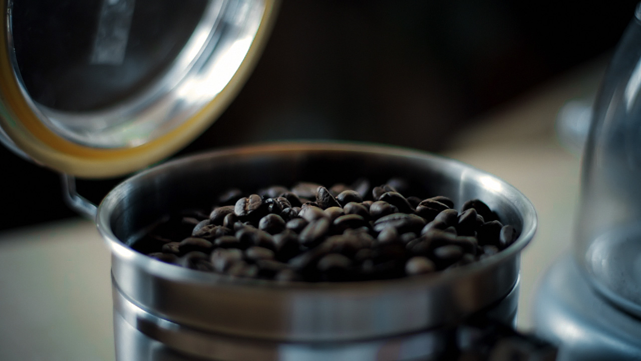
Here’s a very simple example. I bought some espresso beans today from my favorite local roaster, Blue Bottle coffee. As I was transferring them to an air-tight container, my 7D was right there, so I popped off a quick 720p60 shot of the process—because who doesn’t like seeing coffee beans tumble in slow motion?
When looking at the footage on my computer, I noticed a funny thing. The beans, which in life have a vivid, sumptuous brown tone, appeared gray-black on my screen. I almost didn’t notice, because I know they are brown, but on close inspection it was clear that I had been fooled by my brain into seeing what I knew rather than what was actually there. The cool color temperature of the indirect sun lighting the shot was reflecting off the beans and cooling their color down to near neutral.
There’s nothing unnatural or wrong about this, except that the audience for my espresso epic doesn’t know about the cool light source outside of the frame. They don’t even necessarily know what the falling objects are. I have to communicate that visually, so I need to preserve—or, in this case, recreate—the memory color of perfectly roasted coffee beans.
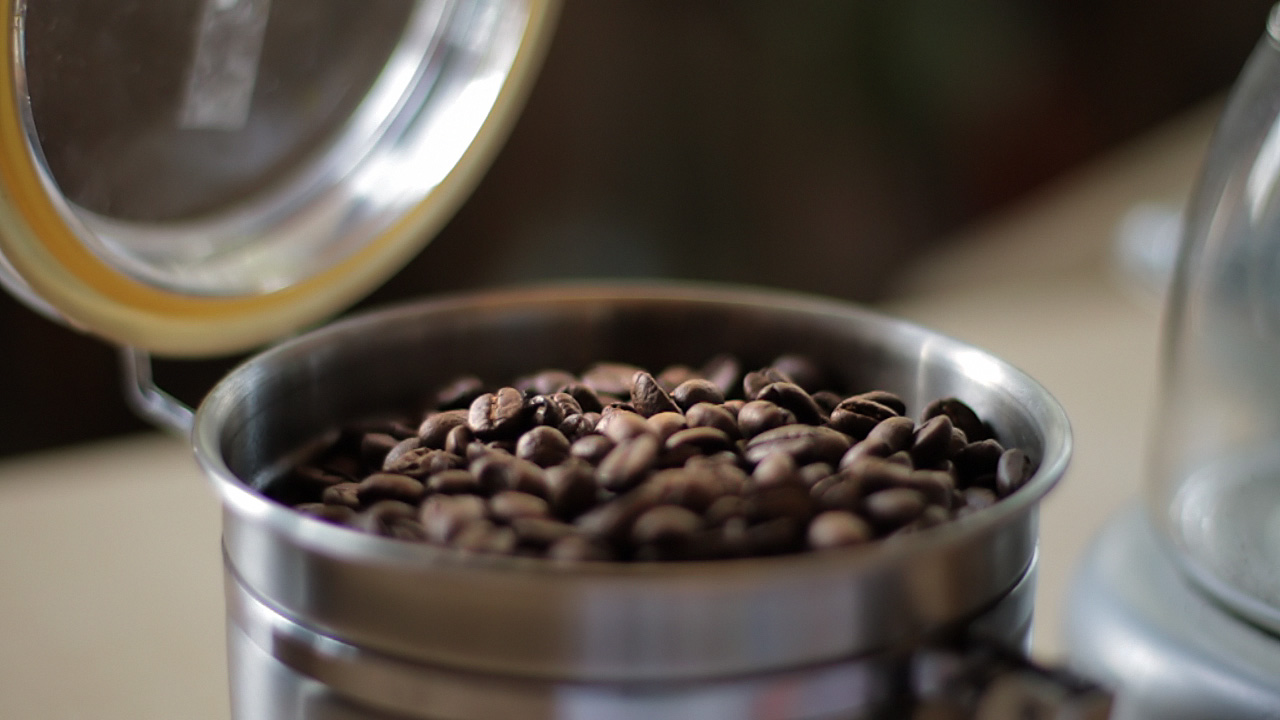
Here’s the shot with a Colorista Power Mask for just the beans:
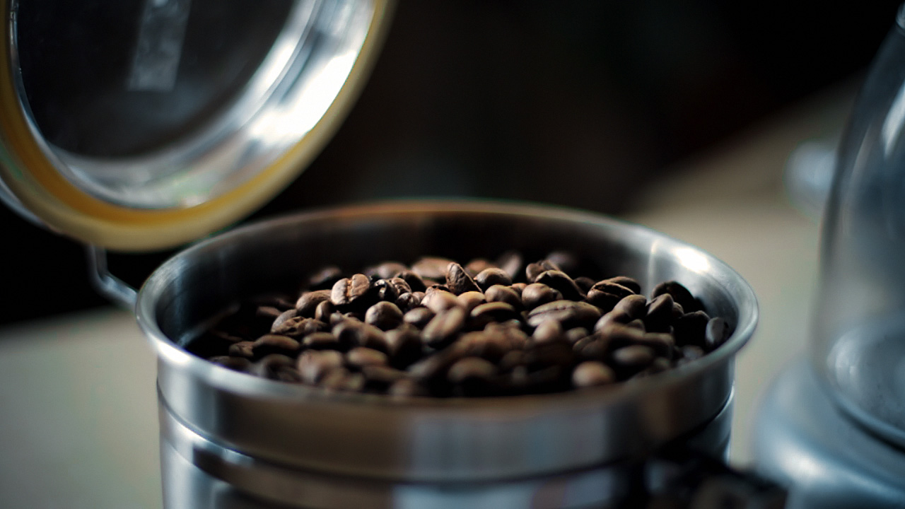
And here’s that same shot with an overall look applied after the bean color fix.
To really see the importance of the local correction, look at the shot with the look, but without the bean fix:
Not only do the beans look more appetizing with the fix, they also survive the subsequent look adjustment better. In fact, since the look cools down the shot a bit, the warm color of the beans stands out all the more. Without the bean fix, the look utterly clobbers the brown beans. As a bonus, in the corrected version, the metal canister and the corner of the grinder on the right take on a steely blue color, better matching the viewer’s idea of what color metal should be.
If you pick your memory colors for a scene, and preserve and enhance them through your look, you’ll wind up with shots that pop without looking clobbered by a heavy-handed “preset” look.
Update on Monday, February 22, 2010 at 3:43PM by
Stu
Folks following me on Twitter know that I’ve been posting the occasional color correction before/after example there. I’ve now collected them here, including a higher-res version of the coffee bean example.
A frequent concern about shooting to a heavily-compressed digital format—something the DV Rebel often finds herself doing—is the degree to which the footage will be “color correctable.” Will the shots fall apart when subjected to software color grading? Or will you be able to work with the footage as fluidly as you tweak your raw stills in Lightroom?
It’s a valid concern. The movies that the current crop of HDSLRs shoot are highly compressed. This compression is perceptual, meaning that it takes advantage of visually similar colors and shapes, and represents those regions with less accuracy than the detailed and varied parts of the image. This makes perfect sense, but often in color grading one seeks to enhance color contrasts—to make a face pop off a similarly-colored background for example—and so you may well create high contrasts between colors that were once nearly identical, and as such were given short shrift by the camera’s compression.
You might have noticed a similar phenomenon in audio. An low-bit-rate MP3 that sounds decent enough can suddently sound awful after even a tiny amount of EQ. Another case of perceptual compression limiting your options.
While you will never find as much data and detail in your HDSLR video as you do in that same camera’s raw stills, the H.264 movies created by the Canon 7D, 5D and 1D Mark IV will withstand some massaging in post. Here are some tips (similar to those found in greater detail in The DV Rebel’s Guide) to help you get the best results.
Shoot flat. If you read Flatten your 5D, you know that I am a proponent of setting up a “flat” Picture Style using the camera’s built-in controls. The same settings I specced out for the 5D Mark II apply to the 7D and 1D Mark IV as well, although with the 7D I’m less likely to use Highlight Tone Priority, as this setting can increase shadow noise, and the 7D is not as noise-free as the other Canon HDSLRs.
Chose WB wisely. Use a white balance preset that gives you as nuetral an image as possible. Shooting with an incorrect white balance reduces your dynamic range, because you wind up with an image that’s prematurely blown-out in one color channel, dark and noisy in others.
Expose to the right. Make the brightest image you can without clipping something important. A rule-of-thumb considered gospel by many photographers, but our reasoning is a bit different. Yes, we, like the stills guys, wish to avoid excess noise in the shadows, but that’s not our main concern. Remember that term perceptual compression. Dark areas of an image get less bits. If you underexpose, you’ll have to brighten the image in color correction, and you’ll reveal all kinds of nastiness the camera thought you’d never see.
Do denoise. It doesn’t really matter what denoising software you use, but use it. When you carefully and subtly denoise your footage, you rebuild your pixels anew, which is especially nice when you follow the next tip:
Work at high bit-depths. If you start with an 8-bit image and do a gentle de-noise, you’re blending pixels values together to create new colors. Although there’s no such thing as something for nothing, doing this at a higher bit-depth means those new colors have massivly more gradations than the original image. Your subsequent color work will hold up much better.
Sharpen last. Your flat Picture Style removed the camera’s built-in sharpening. Add your own at the very last step. The amount you use will vary depending on the output medium, so test test test.
By folllowing these guidelines you can make good-looking shots even better with color correction. But what about a shot that isn’t so great to start with? Turns out there’s hope. Below is a 7D shot that I grabbed in an uncontrolled situation. In my haste, I underexposed, and used the “cloudy” white balance when I probably should have used tungsten. But with a little denoising, careful analysis of the colors in the image, and a Colorista Power Mask, I was able to rescue this shot.
Yes, you can color correct your HDSLR footage, and you should. Color correction can make a good shot great, and in a pinch, put an unusable shot back in the game.
That’s mounted to my new slider rig from Glidetrack. It’s the Glidetrack HD to be specific, and I chose the 1M length, which feels like the right balance of utility and portability for me. I’m more likely to use it for push-ins than for side-to-side motions, and when you’re using it for the “slow creep,” there’s only so long a slider can be before it shows up in your shot. There are a number of terrific options out there for slider rigs, but the Glidetrack was the right choice for me because of its minimal weight and mechanical simplicity.
Hovering above it all on the Noga arm is the Ikan V5600, which is a comparatively inexpensive, lightweight HDMI monitor. It doesn’t have quite the full 720p resolutionthe peaking features of the Marshall V-LCD70P, [CORRECTION, Mitch below pointed out that the Marshal is not 720p—in fact it has a lower resolution than the Ikan!], but it’s still quite usable for focus. The photo above lies in its streamlined simplicity—the power and HDMI cables for the monitor make it quite a bit messier in practice.
Speaking of focus, the Redrock Micro whip makes that a little easier when back-panning on the slider. The whips come in sets of three — shown below is the shortest of the bunch. The build quality on the Redrock whips is very good.
What’s missing obviously is a good set of sticks, or possibly two, to properly support the Glidetrack. I’m still shopping and open to suggestions.
Gear porn shots like these requires bokake, here courtesy of the Canon 50mm f/1.2L on my 5D Mark II, the price of which was recently lowered.
Disclaimer: I contributed to the design of the Redrock Micro Captain Stubling rig, which recently received a glowing review on episode 53 of the always awesome Red Centre podcast.
As always, I am grateful if you shop through any of the above links, or at the ProLost store 7D Cine page!


 Stu
Stu