Tools

Slugline. Simple, elegant screenwriting.

Red Giant Color Suite, with Magic Bullet Looks 2.5 and Colorista II

Needables
  • Sony Alpha a7S Compact Interchangeable Lens Digital Camera
    Sony Alpha a7S Compact Interchangeable Lens Digital Camera
    Sony
  • Panasonic LUMIX DMC-GH4KBODY 16.05MP Digital Single Lens Mirrorless Camera with 4K Cinematic Video (Body Only)
    Panasonic LUMIX DMC-GH4KBODY 16.05MP Digital Single Lens Mirrorless Camera with 4K Cinematic Video (Body Only)
    Panasonic
  • TASCAM DR-100mkII 2-Channel Portable Digital Recorder
    TASCAM DR-100mkII 2-Channel Portable Digital Recorder
    TASCAM
  • The DV Rebel's Guide: An All-Digital Approach to Making Killer Action Movies on the Cheap (Peachpit)
    The DV Rebel's Guide: An All-Digital Approach to Making Killer Action Movies on the Cheap (Peachpit)
    by Stu Maschwitz

Entries in DV Rebel's Guide (90)

Wednesday
Jun152011

What I Do With My iPad Part 1: Storyboarding

There’s an iPad stylus review buried in here. But first, some background on why I’m so excited to be storyboarding on a tablet.

As I detailed in The DV Rebel’s Guide, storyboards don’t have to be immaculately drawn to be effective. Which is lucky for me, because I have let wither whatever drawing ability I once had. To me, the boarding process is about flow. I need a tool that allows me to bang out my ideas as they come. For as long as I can remember, that’s been printed storyboard templates and a mechanical pencil. That’s how I whip up my “thumbnail boards,” which are usually stick figures, arrows, and incomprehensible squiggles.

This process is then followed by a rather ugly chore of scanning, cleaning up, and cropping in Photoshop.

To speed the process and avoid the manual labor, I’ve tried using various storyboarding systems and software, including ClipSketch and Storyboards on the iPad and SketchUp on my laptop, but I always come back to the simple, expressive basics of hand-drawn boards. They may be simple, but they’re my simple, and the camera angles I draw are never limited by what clip art I had on hand.

In the early days of the iPad, one of the first apps I bought was Penultimate by Cocoa Box Design. Penultimate was designed to be your digital Moleskine notebook, a simple and elegant blank page on which to doodle, sketch, or write. Whether it was the elegance of the app or the fluidity of the pseudo-pressure-sensitive drawing, Penultimate earned a permanent place on the front screen of my iPad.

I approached the developer, Ben Zotto, about my desire to use Penultimate for storyboarding. The app then offered a selection of three paper styles; plain, lined, and graph. Rather than myopically suggesting he add storyboarding templates, a rather niche use case, I suggested that it might be of general interest to his users to allow custom papers. I must not have been the only one thinking this, because just this May, Ben released Penultimate 3.0 with exactly that feature. He even used a film storyboard as his example.

Why is Penultimate, a simple, general-purpose notebook app, the best iPad storyboarding tool? Turns out there’s a critical mass of features that add up to awesome: 

  • Custom templates (papers)
  • Delete, re-order, and duplicate pages in a lovely thumbnail view
  • The best “feel” of any iPad drawing app (especially with a stylus, see below)
  • Just the right number of ink colors (almost, see below)
  • Easy PDF export of all or just some of your pages

The DV Rebel often repurposes tools from other disciplines. Penultimate is a great example of filmmaking software that isn’t just for filmmaking. I’m so fired up about my new storyboarding workflow that I’m sharing my Prolost storyboarding templates.

There are templates for HD aspect ratio and ‘scope, portrait and landscape. The landscape ones come in variations featuring a rule-of-thirds grid and a “blackout” look. Tap these links on your iPad and they’ll open in Penultimate.

Prolost Scope

Prolost Scope Grid

Prolost Scope Blackout

Prolost Scope Verbose

Prolost Scope Triple

Prolost HD

Prolost HD Grid

Prolost HD Blackout

Prolost HD Verbose

Prolost HD Double

Some tips:

  • You can change papers anytime as you’re working. So, for example, you could switch the thirds grid on and off as needed.
  • Most of the HD templates have a corresponding layout in the ‘scope aspect, so you can see how your shots will look framed for either format by switching papers.
  • You can choose whether the paper pattern is exported with the drawings or not.
  • You can choose which pages get exported when saving/sharing a PDF.
  • Landscape mode is not as slick as it should be when re-ordering pages or exporting. On the Mac, you can use Preview to rotate your pages to the correct orientation and re-save the PDF.
  • To make your own template, make a black-on-white PNG file at 718 by 865 pixels, and save it to your iPad’s Photo Library. You can then import it in the Papers popover menu.

Aside from better landscape support, what’s missing from Penultimate? Not much. The app allows single frames to be saved and shared as JPEGs, but only allows multi-page export as PDF. For my workflow, I’d occasionally like to export a series of JPEGs. I’d also like just one more pen color: a barely-there gray for roughing-in a drawing before refining it in black or dark gray.

The Boxwave Capacitive Stylus and the Wacom Bamboo Stylus for iPad

If you’re going to be drawing on your iPad, you’re going to want a stylus. I’ve owned three, the PogoSketch, the BoxWave, and Wacom’s Bamboo Stylus for iPad.

The Pogo Sketch is affordable enough to buy just to decide if you like using a stylus with your iPad. It’s also available at most Apple retail stores, although you’ll have to ask for it — it’s not on display.

The BoxWave is almost as affordable as the Pogo, but I found it to be much better. It’s small, as these things seem pathologically intent on being, and light. But the rubber tip gives a great drawing feel on the iPad screen, and it features a clever tether with a plastic plug at the end that fits in your tablet’s headphone jack, which improves your chances of actually having the dang thing with you when inspiration strikes.

Wacom makes the wonderful and not inexpensive tablets and Cintiq pen displays, so leave it to them to come out with a premium capacitive stylus. Their Bamboo Stylus for iPad is the most expensive one I considered. It’s got a nice heft, it’s long enough for grown-ups, and it has the finest tip I’ve seen on an iPad stylus — which may or may not mean anything tangible, but it just seems to feel better in use.

Expensive things are expensive. But to me, a $10 stylus that I never use is more expensive than a $30 that I love and use often. The Bamboo is by far my favorite and worth every penny it cost, and every day I waited for it to arrive.

What do you do with all these drawings once they’re done? You might consider dropping them into Storyboard Composer (UPDATE: Now available for iPad as Storyboard Composer HD) or build an interactive presentation of them in Keynote or the excellent Portfolio (all of which would be much easier with multi-page JPEG output). You might bring them into After Effects or your favorite NLE to cut them into an animatic. Our you might just work with them as a PDF or a printout. Whatever you do, I think you’ll find that drawing storyboards on your iPad is finally ready to replace paper and pencil.

See also: What I Do With My iPad Part 2: Write With a Keyboard

Friday
Apr082011

Two Free Color Correction Plug-ins from Red Giant Software

Today Red Giant Software released two new Magic Bullet effects for Final Cut, Premiere, and After Effects, and they are 100% free for any kind of use.

First up is Colorista Free. Part of the goal of the original Colorista was to create a single, easy-to-use 3-way color corrector that would be consistent across multiple platforms. When we updated it to Colorista II, the goal expanded to packing as much color correction power as could possibly fit into one effect. Colorista II has been extremely popular, which warms my heart, because it means filmmakers everywhere are putting real care into their color correction work.

But I never lost sight of that original goal of creating a color corrector that everyone could use. I pointed out to the team that Rebel CC continues to be a popular download from Prolost. We joked internally that Colorista II was so powerful, we should just give the original Colorista away for free.

And then I stopped laughing.

Colorista Free isn’t exactly the original Colorista. It lacks a few features, most notably Power Masks. But by stripping it down to something simple, we enabled a feature that even Colorista II can’t boast: CDL compatibility.

CDL stands for Color Decision List. Like an EDL, but for color corrections, the CDL is a method of sharing simple, primary grades between different systems. It was created by the American Society of Cinematographers and is supported by nearly all high-end color grading systems.

Twirl open the CDL section of Colorista Free and you’ll see nine sliders called Slope, Offset, and Power. These, along with the Saturation control, are the ten values that the CDL uses to communicate a grade. You can edit them directly if you like, but you don’t have to—they are a mirror of the color wheels. If you have CDL values from another system, you can enter them manually, or create a scripted workflow that transfers values to and from these sliders.

The CDL is an emerging standard and the workflows surrounding it are not set in stone, so we’re releasing Colorista Free as “workflow ready,” in part to help encourage people to use the CDL, and maybe even share the scripts and tools they use to build a workflow around Colorista Free and other CDL-compliant tools.

If you want an easy way to ensure that CDL values stay attached to your shots, Colorista Free allows you to burn them in to the image. In this way you could do a rough color pass on an edit and send it along to an online color session. The colorist can use the values burned-in to the image as a starting point for their grading, even if they don’t have an automated CDL pipeline.

Or you can just ignore all that stuff and add a free color corrector to your arsenal, confident that you can share your projects with others without requiring them to buy any plug-ins.

Magic Bullet Colorista Free works with Adobe After Effects CS3, CS4 and CS5, Adobe Premiere Pro CS5 and Final Cut Pro 6 and 7.

LUT Buddy is also about sharing color corrections, but in a completely different way. Look Up Tables, or LUTs for short, are compact files capable of holding complex color adjustments. People use LUTs to share color grades, simulate display devices and film stocks, and correct gamma and color space issues. The problem is, they’re hard to make. LUT Buddy solves that handily by drawing an unfolded color cube on your image. You can then color correct it however you like. A second application of LUT Buddy reads the corrected colors from the cube and stores the adjustment as a LUT. You can then save that LUT in a variety of formats, or load it back in to LUT Buddy to apply the color correction. With LUT Buddy, a ten-layer-deep color correction can be compacted into one, tiny file that can be loaded into almost any high-end system, and even used for real-time previews on set.

Magic Bullet LUT Buddy works with Adobe After Effects CS3, CS4 and CS5, Adobe Premiere Pro CS5, Final Cut Pro 6 and 7, and Motion 3 and 4.

Wednesday
Mar302011

Rebel's Guide on your iPad or Kindle, DV Rebel Tools For Free

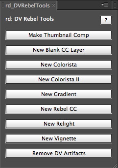
My book, The DV Rebel’s Guide, is finally available as an eBook for Apple iOS devicesAmazon kindle, and anything that reads the epub format (such as the Nook). This has been a long time coming, and I wanted to celebrate by giving away updated versions of the DV Rebel Tools scripts that I included with the original edition of the book.

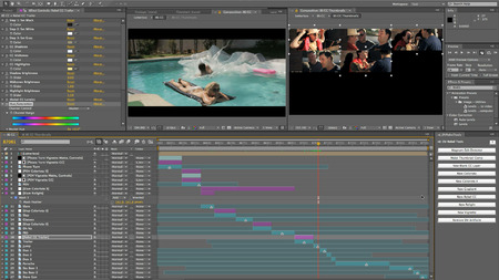
These scripts create a tool palette that turns Adobe After Effects into a full-featured onlining tool. Add color correction effects to clips easily (including Colorista II if you have it installed), and check your grading continuity with a powerful thumbnail view that updates live as you work. For a full tutorial, watch the video:

To install the scripts, download this .zip file and expand it. You’ll see two folders: “Put contents in Presets” and “Put contents in ScriptUI Panels”.

Make sure After Effects is not running. Copy the contents of “Put contents in Presets” into this directory:

/Applications/Adobe After Effects CS5/Presets/

Copy the contents of “Put contents in ScriptUI Panels” into this directory:

/Applications/Adobe After Effects CS5/Scripts/ScriptUI Panels/

Now you can launch After Effects CS5 and find “rd_DVRebelTools.jsx” at the bottom of the Window menu. You can dock the palette into your workspace wherever you like.

Although I created the nerdy expressions and presets that power the DV Rebel Tools, there is a limit to my nerd powers, and that’s where Jeff Almasol stepped in and created the amazing scripts that automate the tools. A big and continued thanks to him. Check out his other handy scripts at redefinery.com.

Monday
Feb152010

Memory Colors

In many of my writings about color correction, both here on ProLost and in The Guide, I’ve talked about the balance between an aggressive “look” that helps tell your story through the use of a pervasive palette, tone, style, and feel; and the preservation of appealing skin tones. When grading a scene, you can push your look much further if you don’t lose track of appealing skin tones. Or, if you so desire, you can make a strong visual statement by choosing to allow your skin tones to get subsumed by your look.

The truth is, skin tones are just one of a small handful of what I call “memory colors.” Memory colors are colors that are, in the minds of your audience, inseparable from certain common objects or events. For example, the sky is so associated with blue that you might feel that you see those two words together as often as you see them individually. The same goes for green and grass.

The most basic idea of color correcting is that you are making colors correct, which is to say that you are making objects on the screen appear to be the colors that we know them to be.

The funny thing about this seemingly simple task is that it can be quite difficult. And it’s difficult for exactly the reason that it’s important.

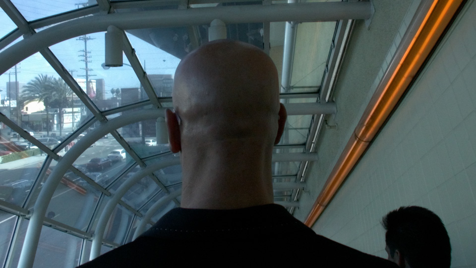
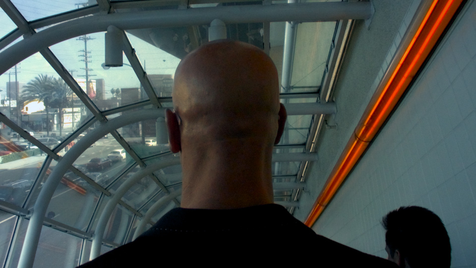
The human brain is so tied in to our eyesight that we internally auto-correct for certain colors. This is the very definition of a memory color. For example, if you grew up in the United States, you know that a stop sign is red—so you tend to see an image of one as being red even if the color is way out of whack. In the shot below, we recognize the bald head as that of a Caucasian male, even though the white balance is incorrect.

We see his head as skin-colored, even though empirically it is actually almost perfectly gray! You might not believe me, so here’s a crop of the back of his neck to prove it:

This a variation of a common optical illusion called the Same Color Illusion. We “know” that square A and B are different shades of gray “in real life,” and that knowledge prevents us from seeing that they are in fact the exact same shade in the image (click the image to see proof).

UPDATE: Aaron points out below that the Color Constancy Illusion may be a better model of the problem.

Back to the head. Even though they “know” what color it is, your audience will respond more favorably to a memory color object if their knowledge of it matches their experience, rather than fights it. And so it falls to the colorist to correct the color of the head, to make it head-colored rather than gray.

In 2008 I pointed out an example of this from the trailer for The Incredible Hulk (Steve Bowen, colorist). Edward Norton’s face appears the same color whether in a cool scene or a warm scene.

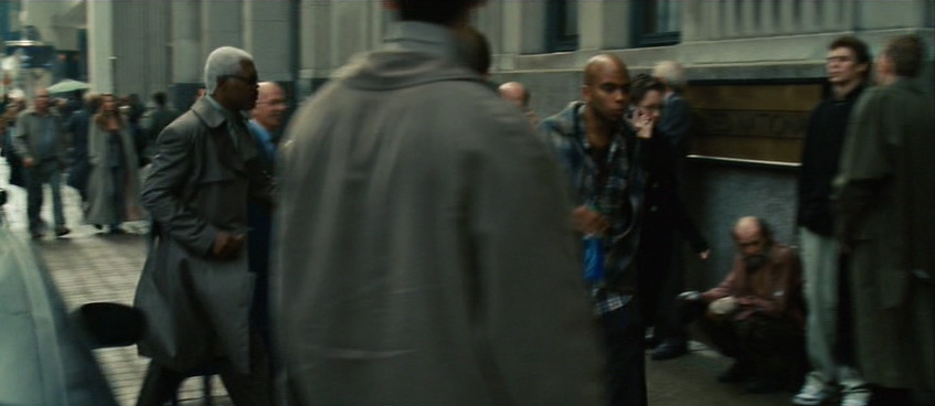
Preserving skin tones is important, but so is preserving other memory colors. Here’s a shot from Jumper (Steven J. Scott, colorist). Sam Jackson is about to walk through a crowd of people. His and their skin tones are accurate, even though their world is a faded, monochrome olive drab.

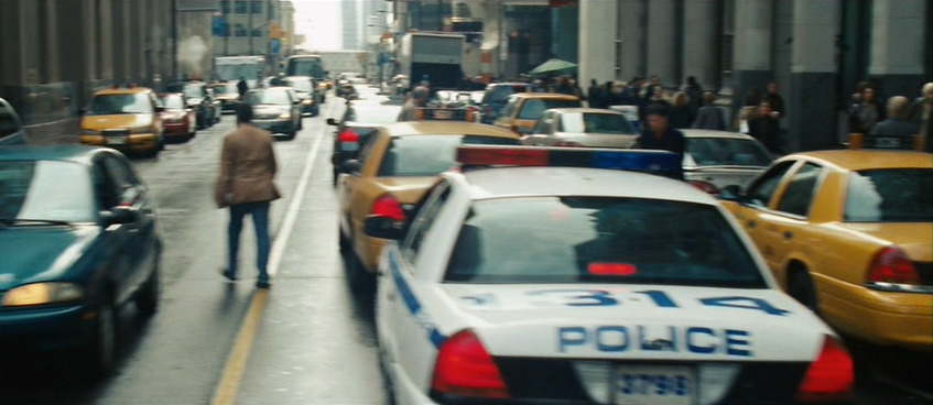
But back up a few seconds in the same shot and notice that in this faded world, brake lights are perfect, vivid red, and New York taxis read as the correct yellow-orange. This is an establishing shot, and if the grade abused the hue of the taxis too harshly, we might not read “New York” as readily.

Here’s a very short list of memory colors I try to keep in mind when coloring:

  • People are pink/orange (a color I like to call porange)
  • Grass and summer trees are green
  • Water and skies are blue
  • Fire engines, stop signs, and blood are red

You could also add just about any food to that list. Unless you’re deliberately trying to make something look unappetizing, it’s probably good to render food as accurately as possible—as I’ll show you in a moment.

I welcome your suggestions of other memory colors. And bear in mind that memory colors might vary from film to film and even scene to scene. In Stomp the Yard, there’s a scene at the beginning where almost nothing is red. Later, there’s a red jacket color so important to the story that it leaps out of every scene in which it appears.

So what’s the big deal? Objects have colors, and the colorist makes sure those things stay those colors. Easy, right?

Not necessarily. To achieve the look of that Jumper shot—where key colors pop but unimportant ones blend into a complimentary shade of blue-green—requires practice, skill, and taste. It’s hard enough under the best of circumstances, but lighting, atmosphere, bounce light, flare, camera settings, and a hundred other factors can conspire to force objects to render on-screen in colors quite unlike their real-world hues.

The good colorist first picks the memory colors important to the scene, and then ensures that they stay consistent, often combating these factors to do so.

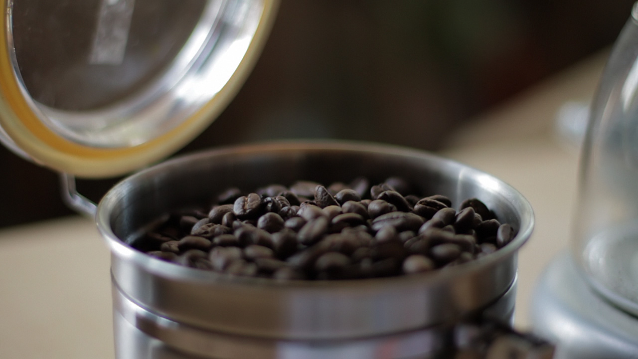
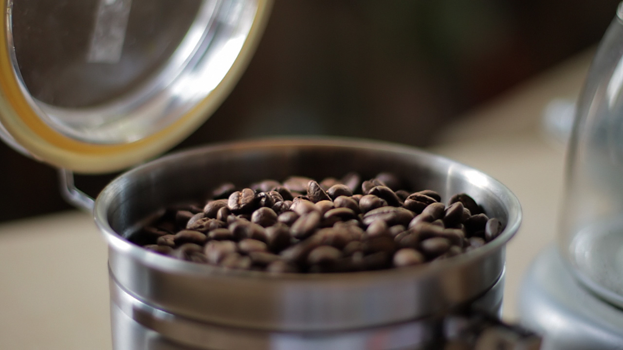
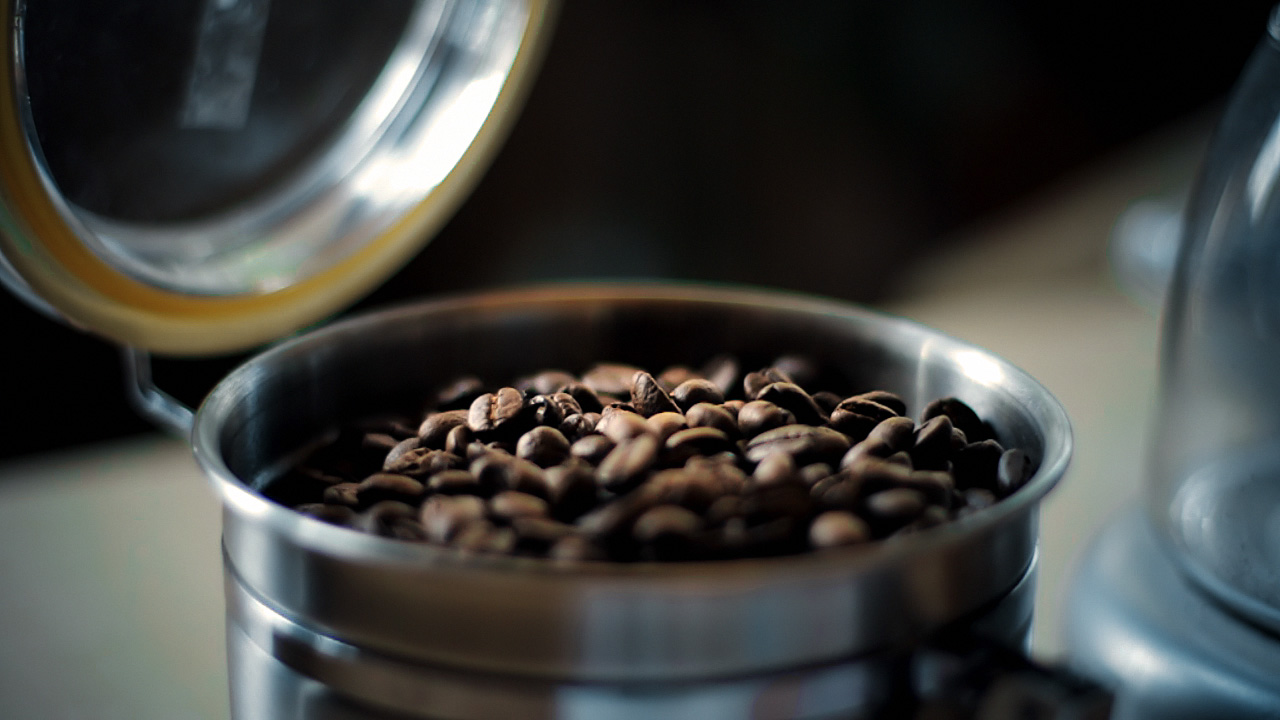
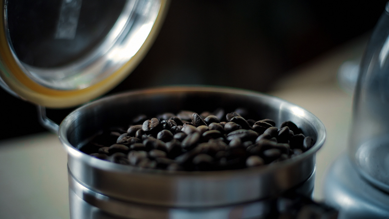
Here’s a very simple example. I bought some espresso beans today from my favorite local roaster, Blue Bottle coffee. As I was transferring them to an air-tight container, my 7D was right there, so I popped off a quick 720p60 shot of the process—because who doesn’t like seeing coffee beans tumble in slow motion?

When looking at the footage on my computer, I noticed a funny thing. The beans, which in life have a vivid, sumptuous brown tone, appeared gray-black on my screen. I almost didn’t notice, because I know they are brown, but on close inspection it was clear that I had been fooled by my brain into seeing what I knew rather than what was actually there. The cool color temperature of the indirect sun lighting the shot was reflecting off the beans and cooling their color down to near neutral.

There’s nothing unnatural or wrong about this, except that the audience for my espresso epic doesn’t know about the cool light source outside of the frame. They don’t even necessarily know what the falling objects are. I have to communicate that visually, so I need to preserve—or, in this case, recreate—the memory color of perfectly roasted coffee beans.

Here’s the shot with a Colorista Power Mask for just the beans:

And here’s that same shot with an overall look applied after the bean color fix.

To really see the importance of the local correction, look at the shot with the look, but without the bean fix:

Not only do the beans look more appetizing with the fix, they also survive the subsequent look adjustment better. In fact, since the look cools down the shot a bit, the warm color of the beans stands out all the more. Without the bean fix, the look utterly clobbers the brown beans. As a bonus, in the corrected version, the metal canister and the corner of the grinder on the right take on a steely blue color, better matching the viewer’s idea of what color metal should be.

If you pick your memory colors for a scene, and preserve and enhance them through your look, you’ll wind up with shots that pop without looking clobbered by a heavy-handed “preset” look.

Want to learn more? Check out some great books on color correction at the ProLost Store, or find more ProLost posts tagged with Color.