Coloring M is for Marmalade
 Thursday, October 31, 2013 at 3:29PM
 Warning! This is a horror short. It’s all scary and stuff. Once again, you are my mom, skip this one.
My buddy Gus Kreiger wrote and directed this short called M is For Marmalade, his entry into the ABC’s of Death 2 search for the 26th director competition. He sent me a rough cut and I liked it so much that I asked if I could do the color grading.
Before we go any further, please take a moment to watch and throw a Facebook Like at the short. The competition is still on, and Likes help Gus win, which would mean his work appearing in the feature film!
OK, thanks. Now, about that color grading!
Gus sent me a ProRes render of his locked cut, along with this email:
First chunk – through the BEEP! at 0:39 – should have a slightly washed out Minority Report/Alfred imploring Bruce in the stairwell of Dark Knight Rises look. After that, with the switch to the kitchen at 0:41, it should jump to a brighter/more vibrant look: we’re in a “different” place.
The vibrancy should then get less and less with each shot so that by the time we’re back to the “bad” place – the drag at 1:17 – the Minority Report look has crept back in. A Blake Snyder “synthesis” moment, if you will, but the “vibrant” shouldn’t go away entirely, as I like that the shots are “pretty” when I’m, like, sawing her arm off.
Final scene at the table (2:39) through end should be very good-looking indeed. Eerily so. Idyllic.
I loved these notes. “Minority Report/Alfred imploring Bruce in the stairwell of Dark Knight Rises look” is a concise description that immediately filled my head with images. I didn’t even look at those films before diving in—I felt that basing my work on my memory of what those scenes look like was the better way to go.
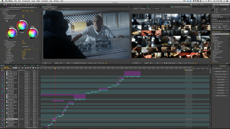
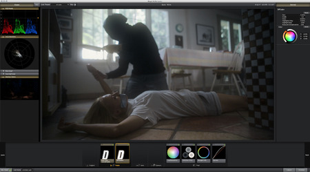
I colored the short using Magic Bullet Looks and Colorista II in Adobe After Effects CC. I used Magnum - The Edit Detector to automatically divide the clip at the cut points. I then placed markers on my hero frames—sometimes more than one per shot—and ran the Make Thumbnail Comp from the DV Rebel Tools. This created a comp for me with thumbnail representations of each shot, automatically fit into a single HD view. As I showed in the tutorial, my workflow is to keep my main color correction Comp View locked on the left, and the thumbnail Comp View locked on the right.
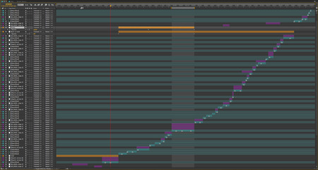
Gus’s desire to tell his story through the contrasting cold and warm “worlds” that eventually collide, worked perfectly with my usual workflow of spanning “look” adjustment layers over several clips in a sequence, and then dialing in each shot for consistency underneath that look.
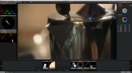
The look layers, shown here in orange, hold single instances of Magic Bullet Looks. Here’s the setup for the warm, happy look:
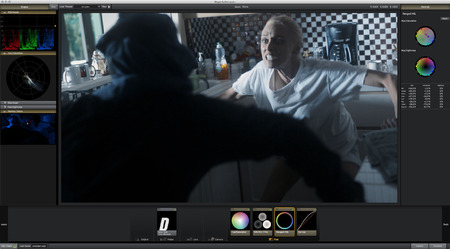
Here’s the Look for the cool section:
Note that each is quite similar in setup. Both have Diffusion to reduce contrast, a Colorista 3-Way Tool to set tone, and a Ranged HSL Tool to restrict and define the palette. The scenes occupy a similar, complimentary slice of the Hue/Saturation scope, each weighted to opposite sides of the wam/cool divide.
For the “synthesis” scenes, where warm meets cool, I decided to express this collision using a cool overall tone that would fight with warmer, glowing highlights trying, and largely failing, to bleed through. So I added a second Diffusion Tool, operating to some extent only on highlights (Highlights Only set to 10%), and then pulled the midtones way down into the Colorista 3-Way Tool. To me, this created the feeling that a warm, sunny day was happening just outside the windows, trying to get in, but was being clobbered by the cold, scary stuff happening in the room.
The short was very well shot by Jeff Moriarty (on a Canon 5D Mark III), so I didn’t expend too much effort on shot-to-shot consistency. But one of the things that got me excited to take this on was that Gus and Jeff rarely repeated a setup, so there were many gorgeous, independent snippets to bring together into one consistent story. So I made some shot-by-shot tweaks, mostly to keep objects consistent in color.
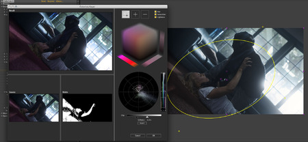
The skin tone of actor Amelia Gotham was very important to me in those opening, cool shots. There was one shot where the light flaring the lens was washing her out enough that I used the Colorista II Keyer to bring her back, just a bit.
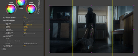
In other shots, I used the Colorista II Power Masks to selectively darken areas of the frame. Here I darkened the area outside the doorway:
I got most of this done in about half a day, and I shared the thumbnail view with Gus as well as a rendered output. He came back with a few minor notes.
After Gus approved my next pass, I turned on Denoiser II (also part of the Red Giant Color Suite) for the entire timeline and rendered out the final ProRes movie, which I then Dropboxed to Gus. Denoiser II was essential in cleaning up the compression and other noise that Canon DSLR footage is famous for, and it allowed me to push my color choices much farther than I otherwise would have.
I sharpened the final comp and reintroduced a tiny bit of noise, and rendered the final ProRes with 32-bit color processing in After Effects.
Here’s a gallery of before and after frames (larger here):
Thank Gus, for letting me help with this short, and allowing me to share the process here.
Happy Halloween!


Reader Comments (6)
Thanks for sharing the process. The color looks amazing as usual. I'm always hesitant to use power masks as when I'm grading it always feels like it's too much, but then I watch your work and realize I'm wrong!
Quick Question.. whats the difference in the two comps Denoise & Deartifact in the first screenshot. I usually just run a pass of Denoiser II at the default settings (sometimes less if the iso was low) and that's it.
Thanks Ryan!
The DV Rebel Tools have a Remove DV Artifacts button that adds an adjustment layer with a chroma-only blur. Rather than add that to each shot, I added it en-masse to a precomp.
So my process goes:
1. Denoise
2. Deartifact
3. Color
4. Sharpen
5. Re-noise
Ah! I'll have to give that a try. I have the DV Rebel Tools. Not sure how I ever got along without the Make Blank CC adjustment layer.. I use it for EVERYTHING.
Nice read, thanks!
One question though regarding your workflow:
You re-apply noise/grain at the end of the process. I sometimes find that the grain feels like an overlay, instead of being integrated into the image. If the grain is applied before color correction, then it's graded in the same way as the rest of the image. What's your thought of this workflow? Or maybe it's different depending if it's noise or grain?
Cheers!
Jack, in this case it's not enough noise to appear as grain. Just adding a bit of "life" back to the pixels.
Awesome, thanks for the breakdown Stu.